your brand is an intimate journey that accounts for your tribe’s decision to love you and love you hard.
we capture forever feelings through brand identity and rich, visual storytelling.
We scoop you in, push your boundaries and establish invigorating brand strategies. We fine-tune your vision board and build a foundation that focuses on what makes your business unique. And through the lens of candid photography, we shape beautiful stories that are consistently woven through every touch point of your business.

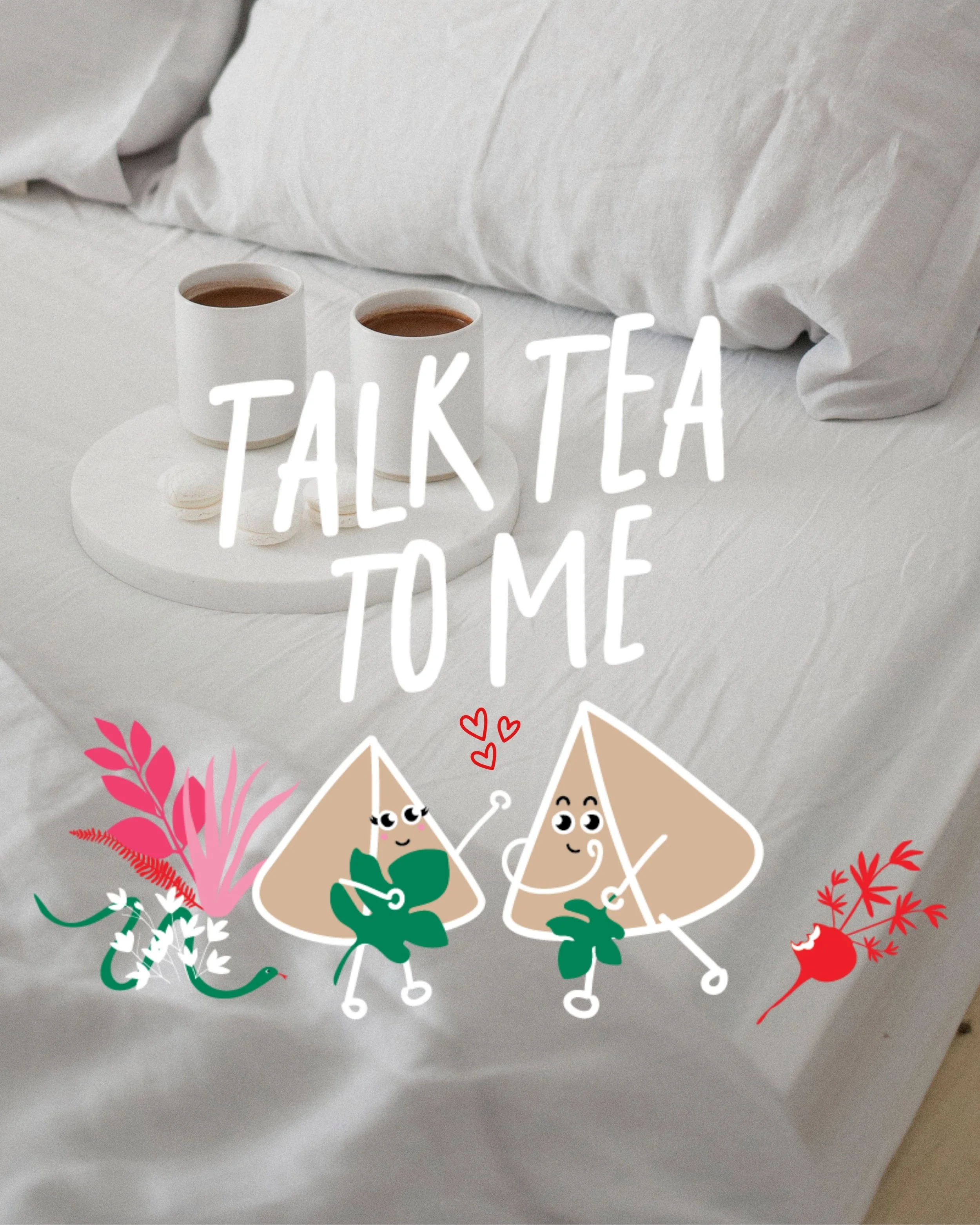
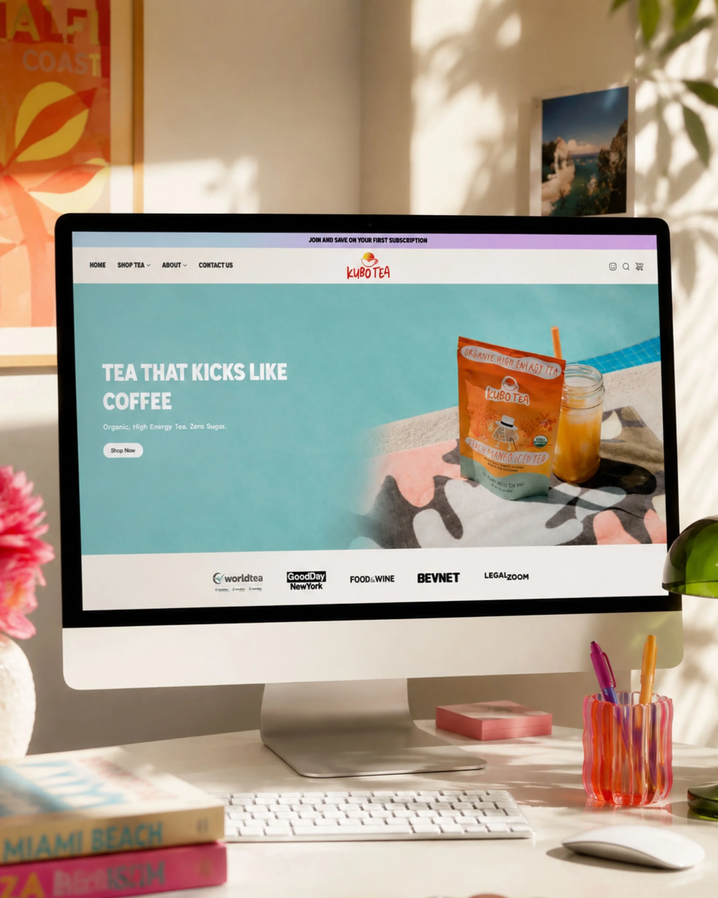
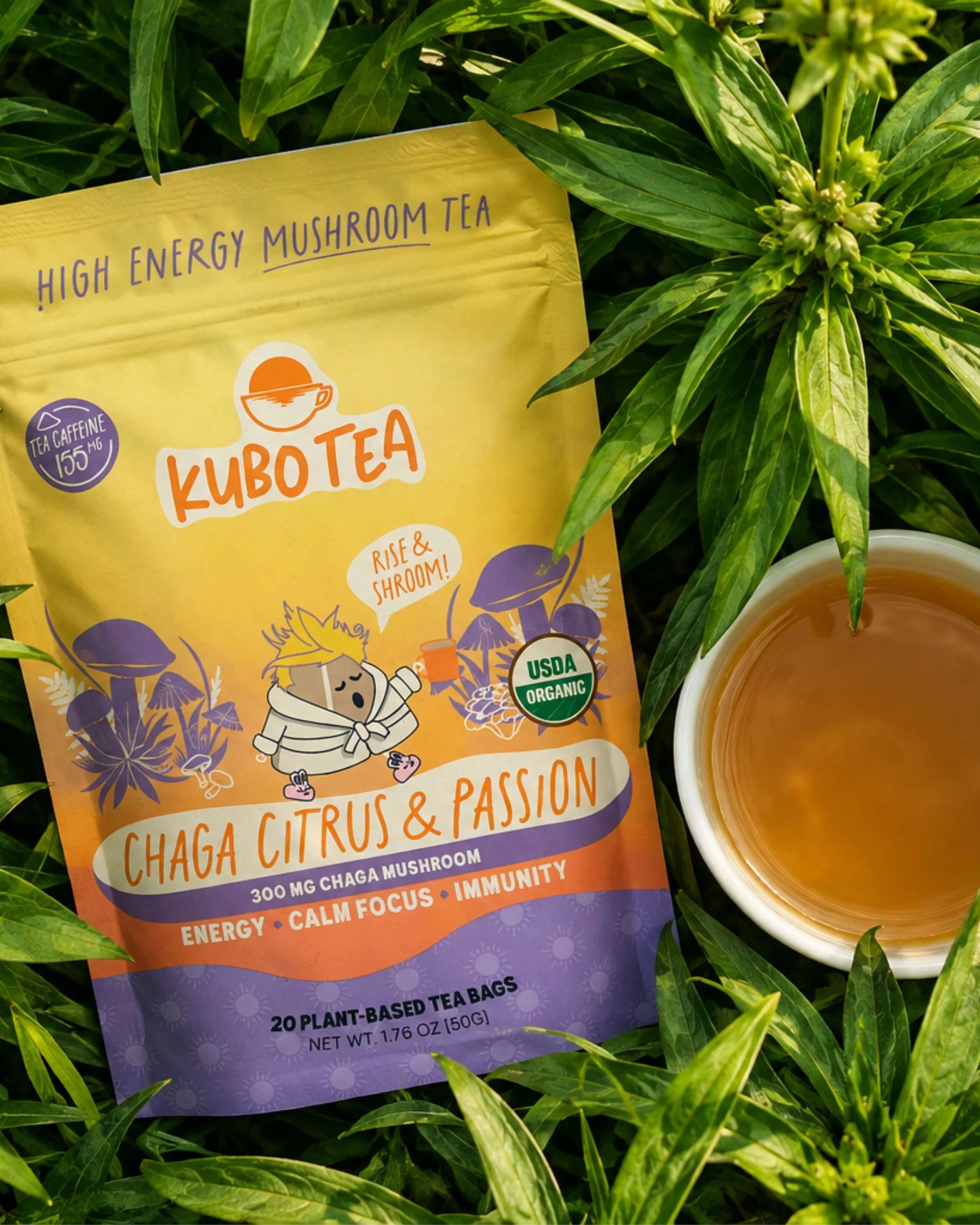
Kubo Tea
A bold, playful brand built to make tea feel anything but boring. Kubo Tea brings together high-energy color, hand-drawn illustration, expressive typography, and a little irreverent personality to position tea as a fresh alternative to the everyday coffee routine. From the brand identity and packaging to campaign creative, apparel, digital design, and retail activations, every touchpoint was designed to make Kubo feel energetic, approachable, and impossible to ignore.


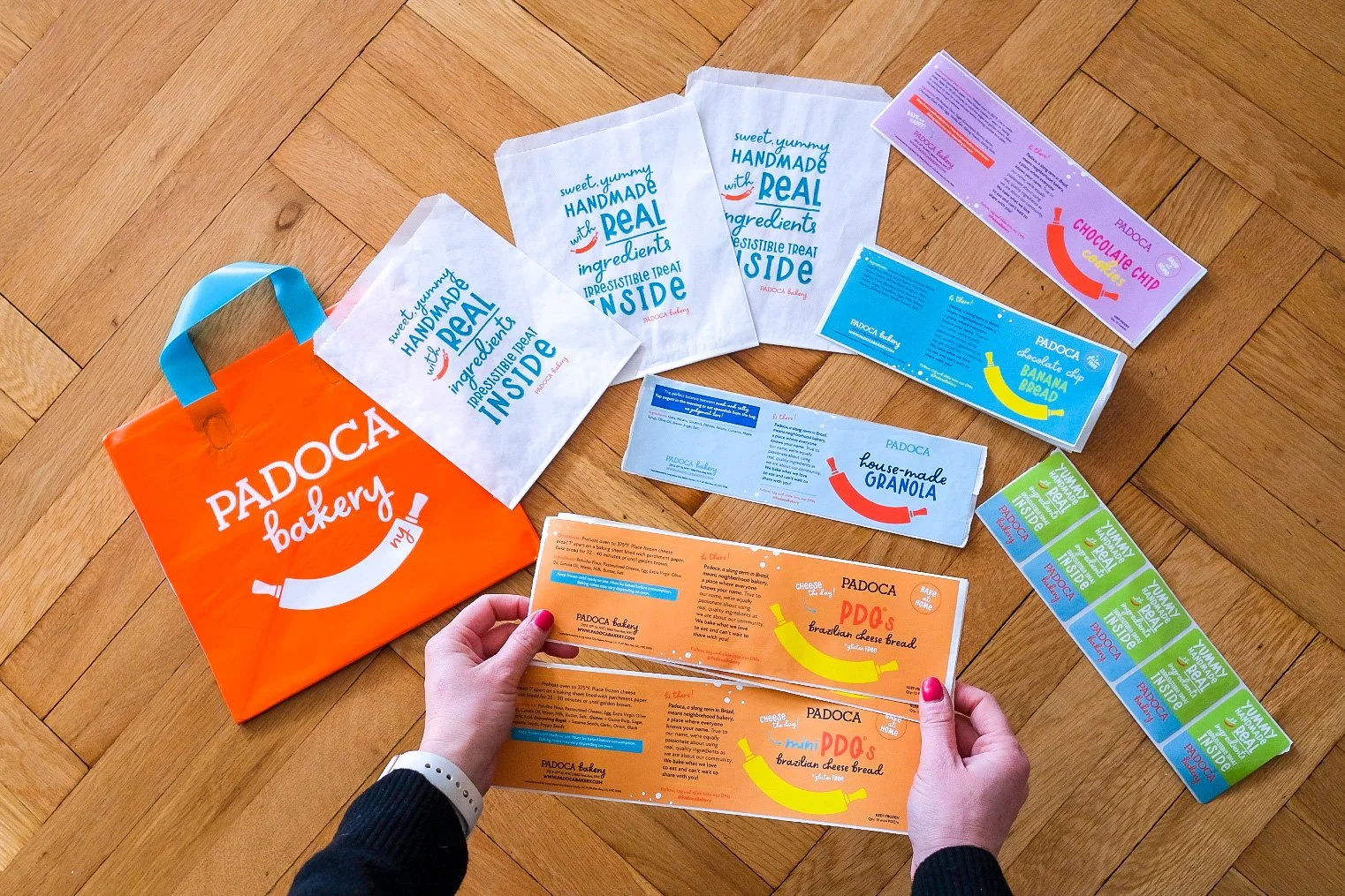
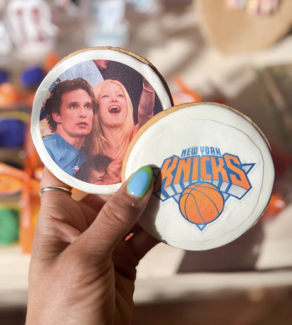
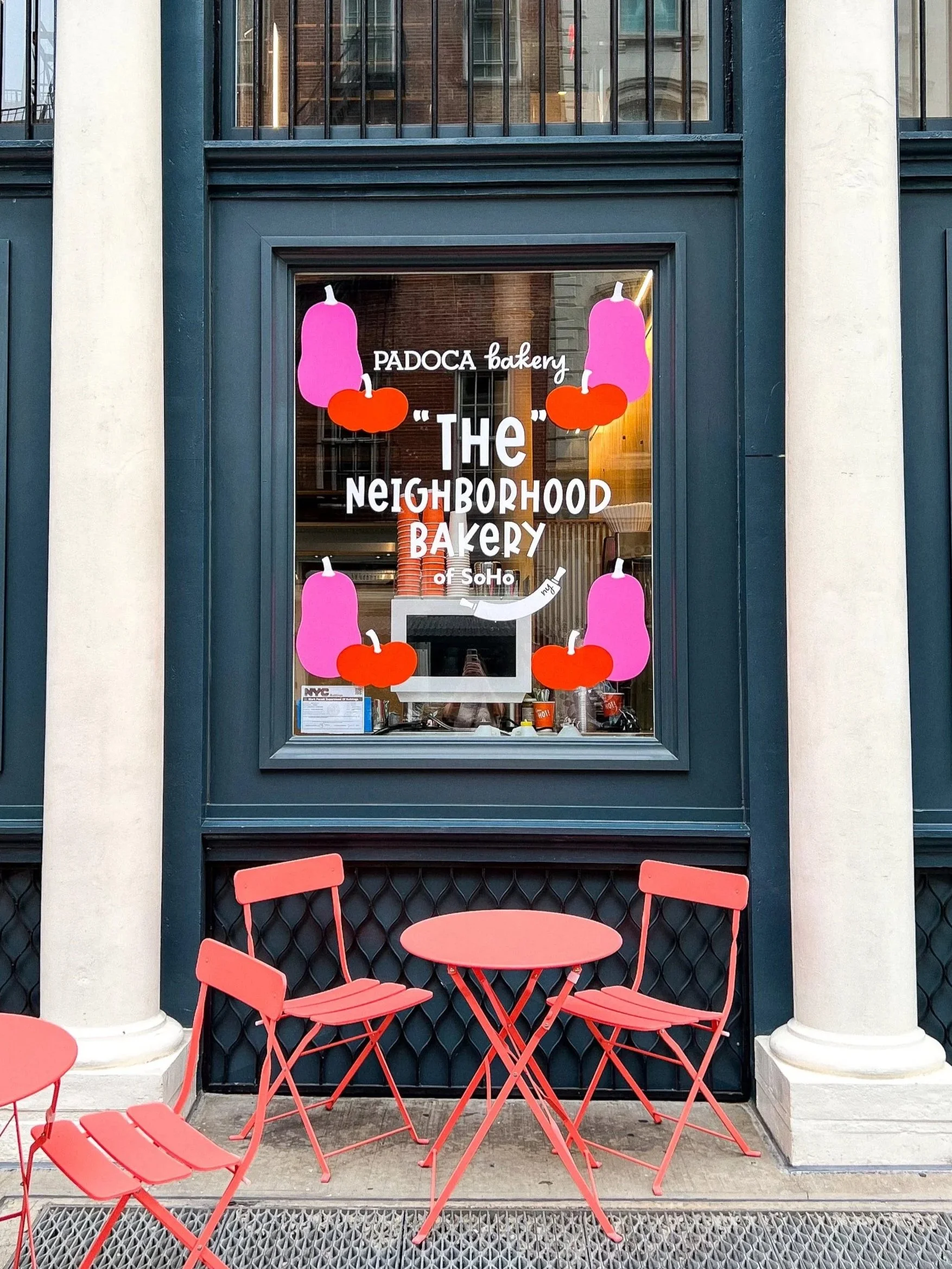
Padoca Bakery
More than a bakery, Padoca is a brand built around community, personality, and a little bit of fun. From shaping the brand story and visual identity to developing campaigns, partnerships, creative collaborations, packaging, in-store experiences, and everything in between, the creative direction touches every part of the business. The goal is simple: make Padoca feel unmistakably like itself—bright, playful, unexpected, and always rooted in its neighborhood.
My Pediatrician Friend
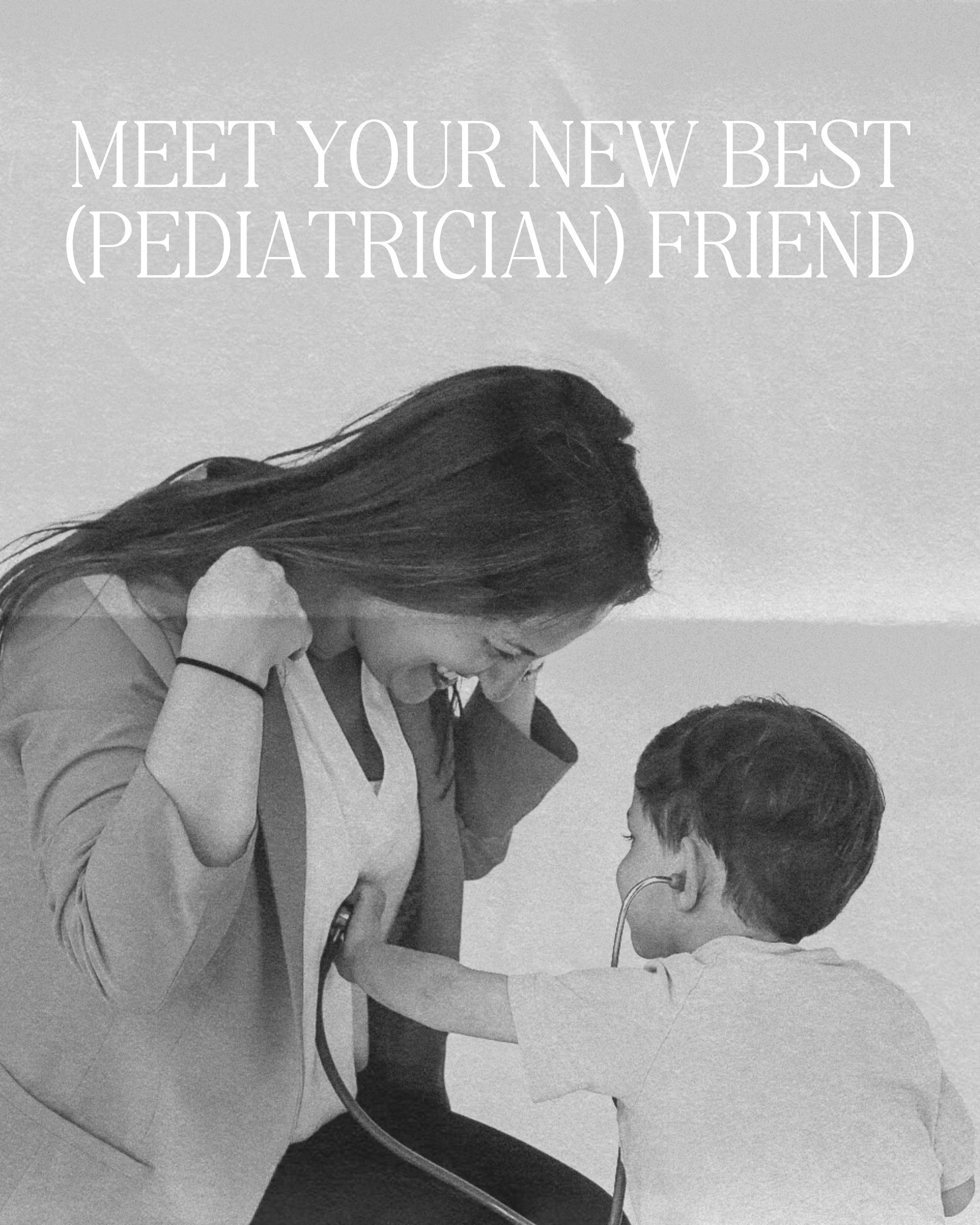
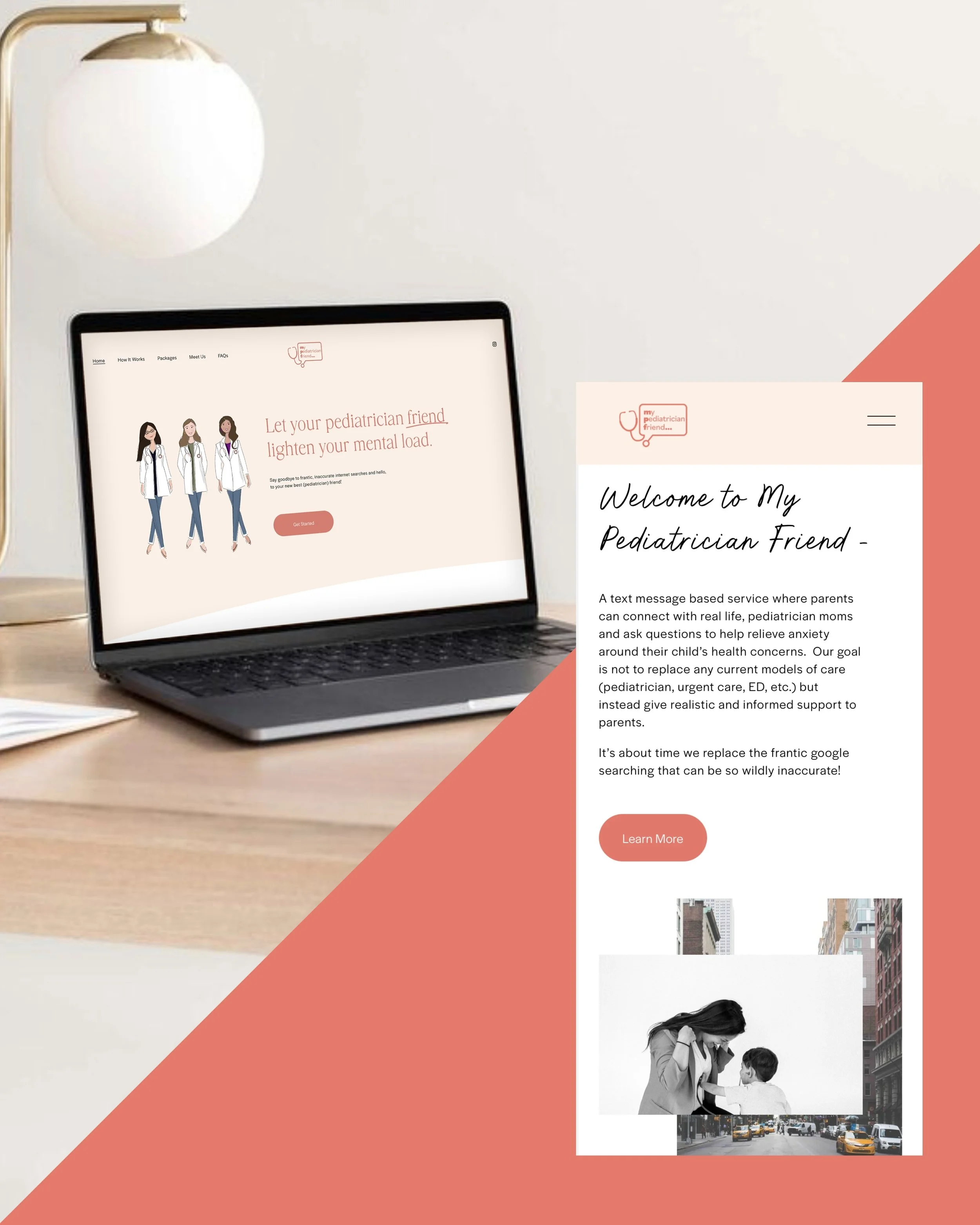
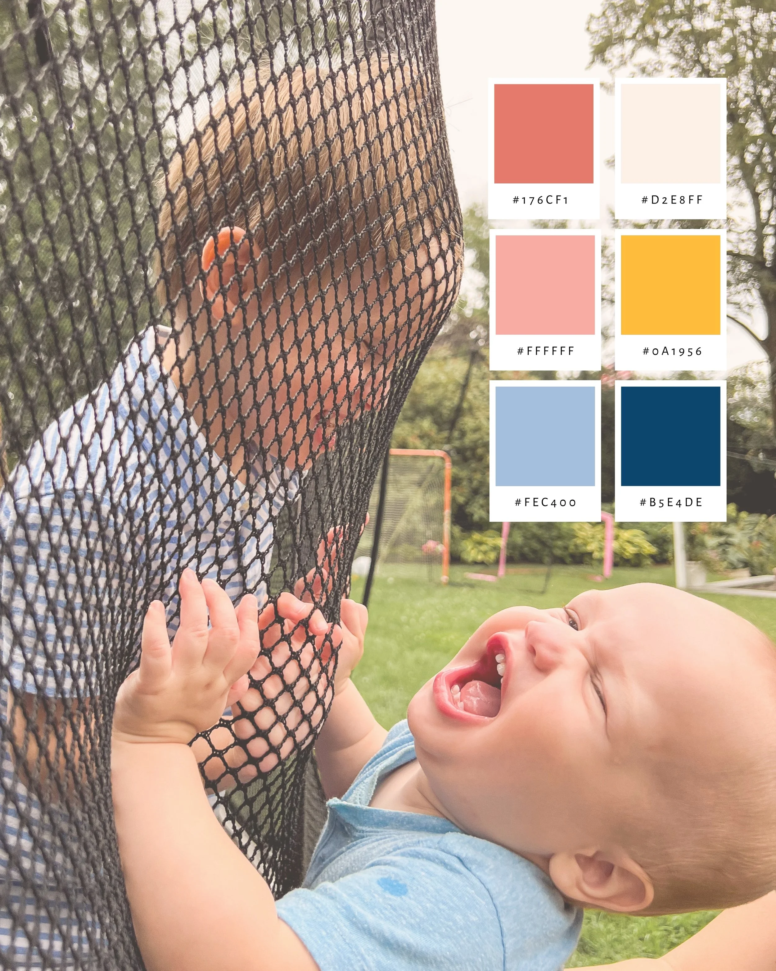
A brand identity created to make pediatric care feel more approachable, personal, and friendly. My Pediatrician Friend brings warmth and personality to the world of healthcare through a playful visual identity, soft yet vibrant colors, custom illustrations, and an approachable tone of voice. From the logo and brand system to the website, photography direction, and supporting marketing materials, every touchpoint was designed to feel welcoming to both parents and their little ones.


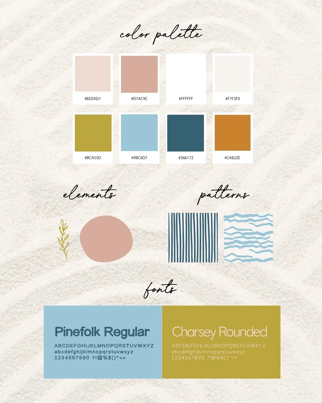
Deep Roots
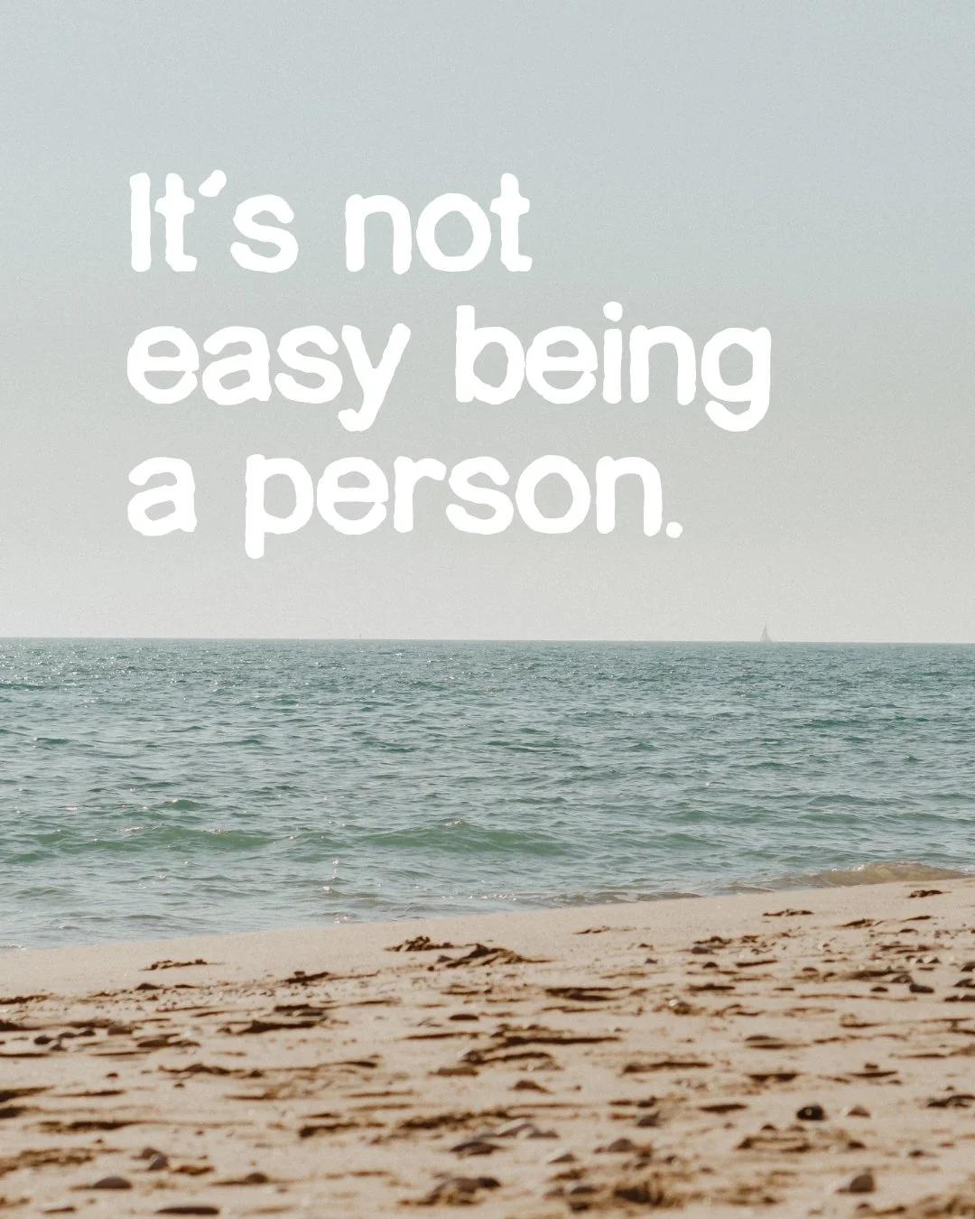
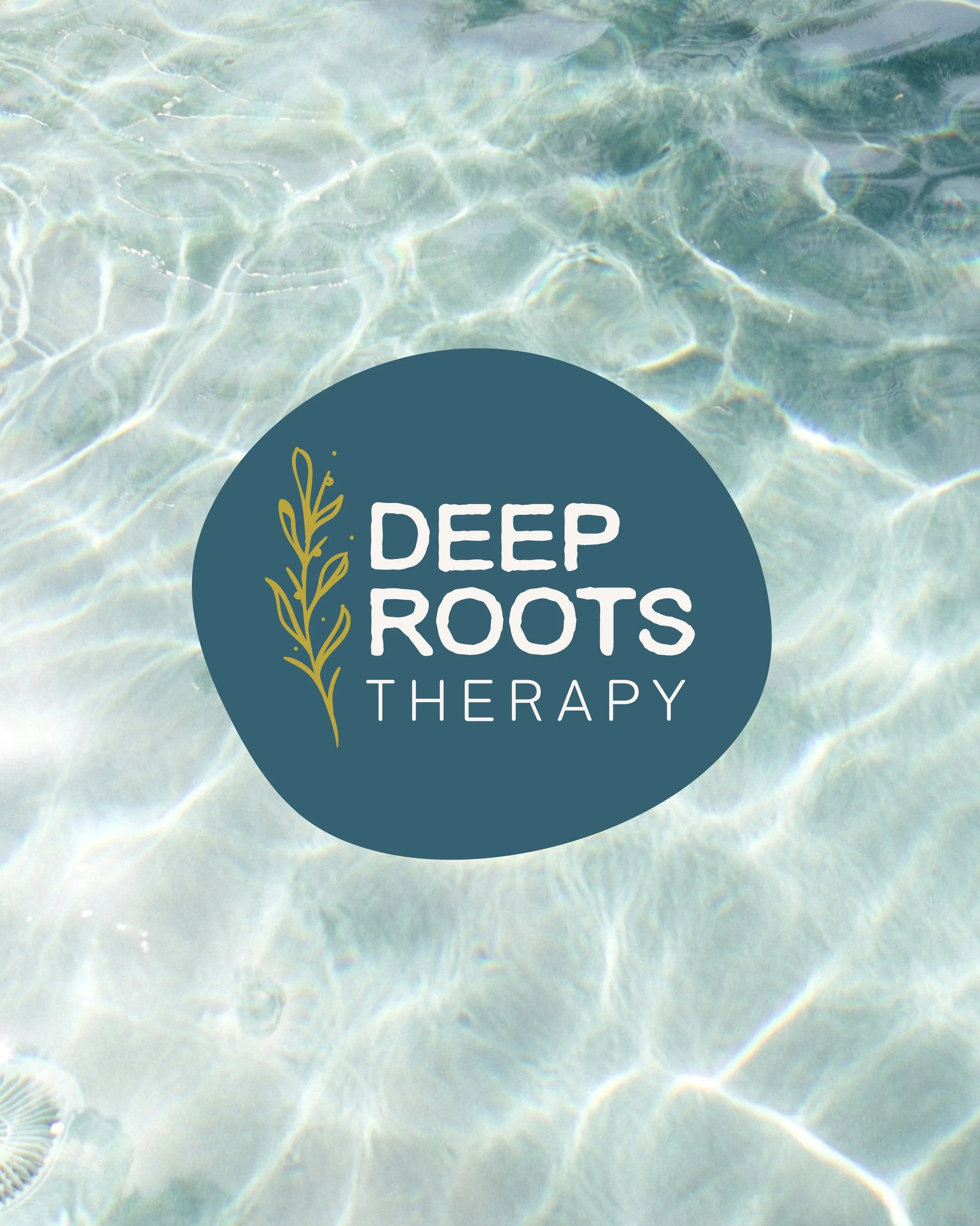
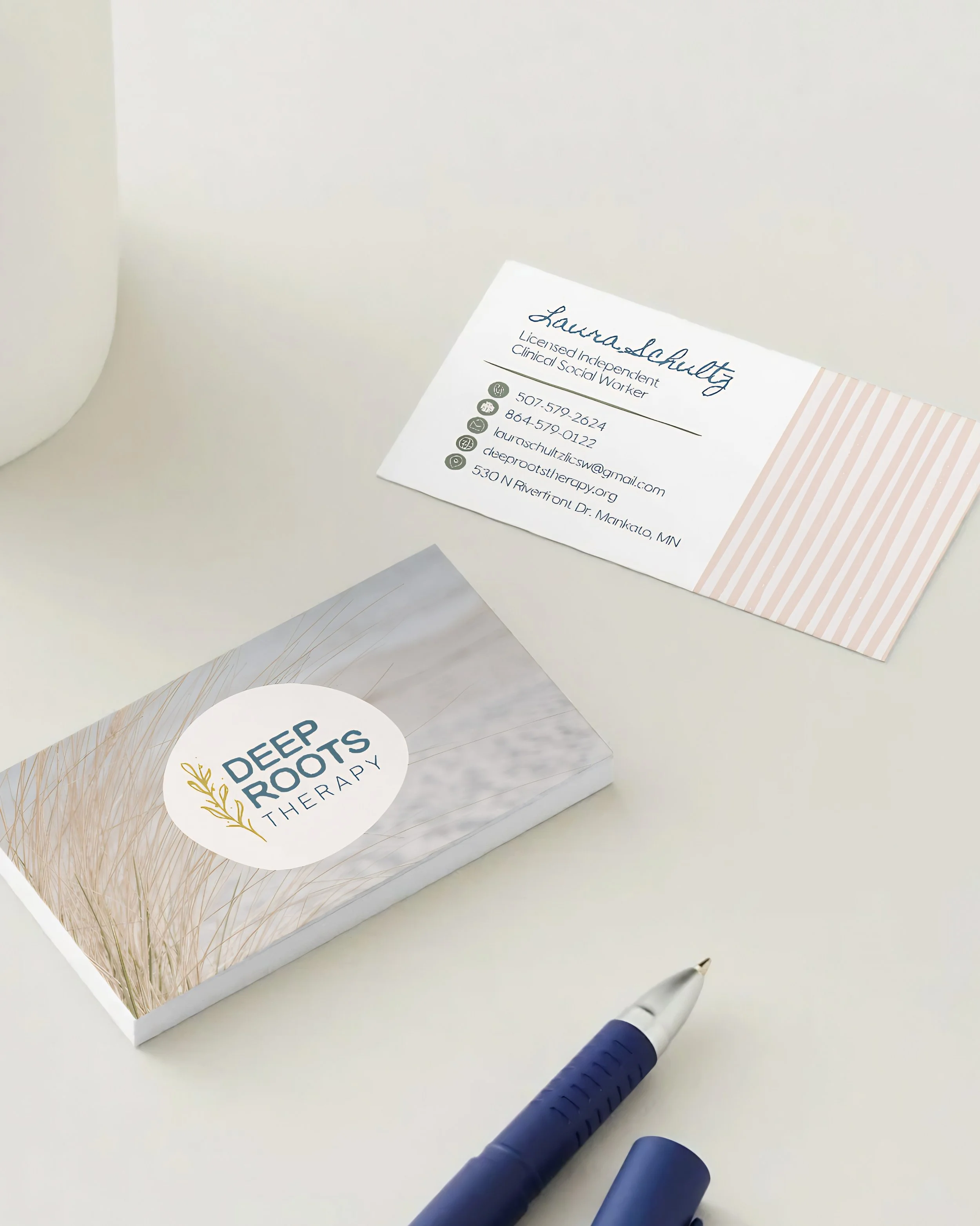
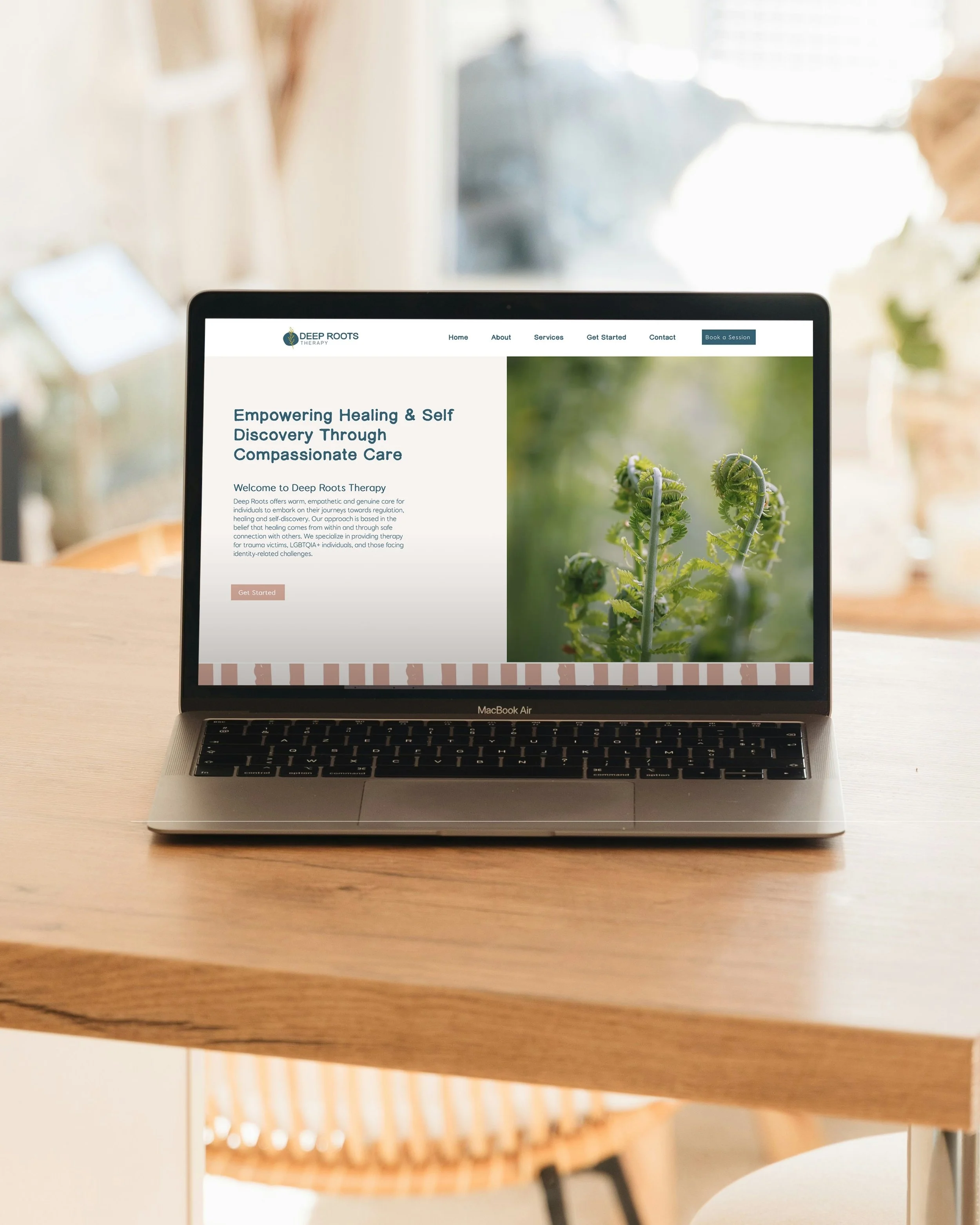
A brand identity rooted in warmth, growth, and connection. Deep Roots Therapy’s visual language pairs calming coastal tones with organic textures, playful typography, and hand-drawn elements to create a space that feels approachable, grounded, and distinctly human. From the logo and color palette to patterns, typography, and printed materials, each detail was thoughtfully designed to bring personality and warmth to the therapy experience.
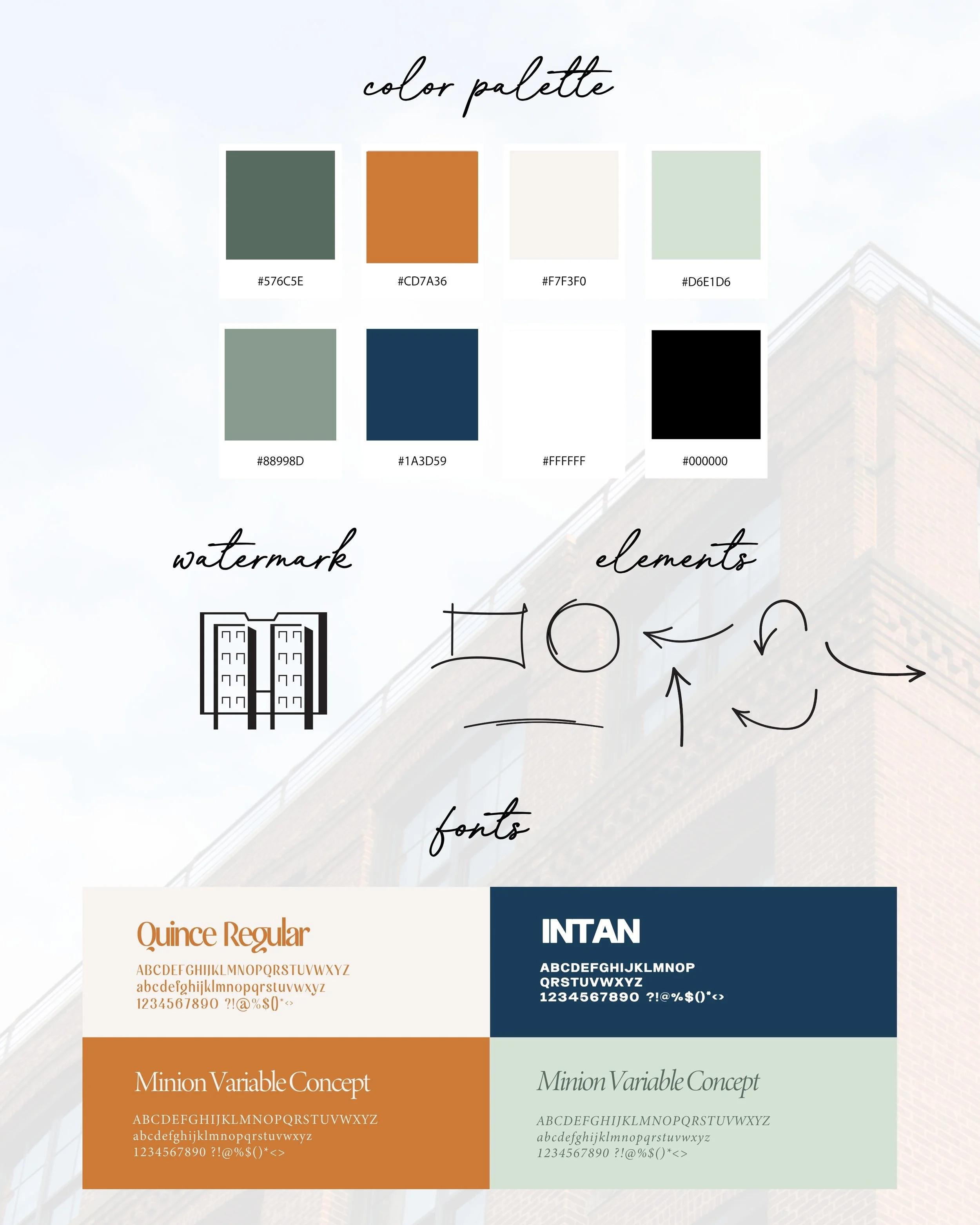
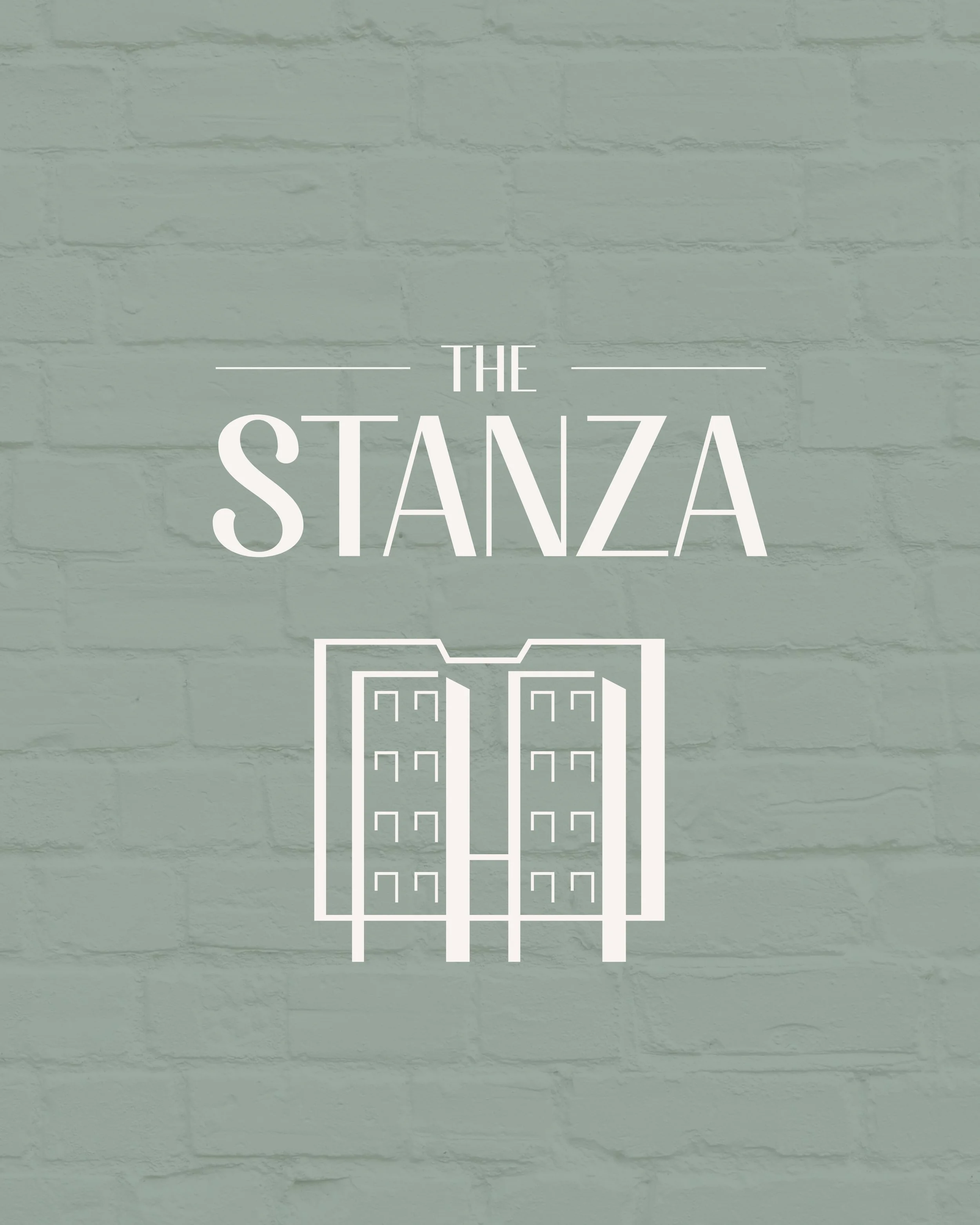
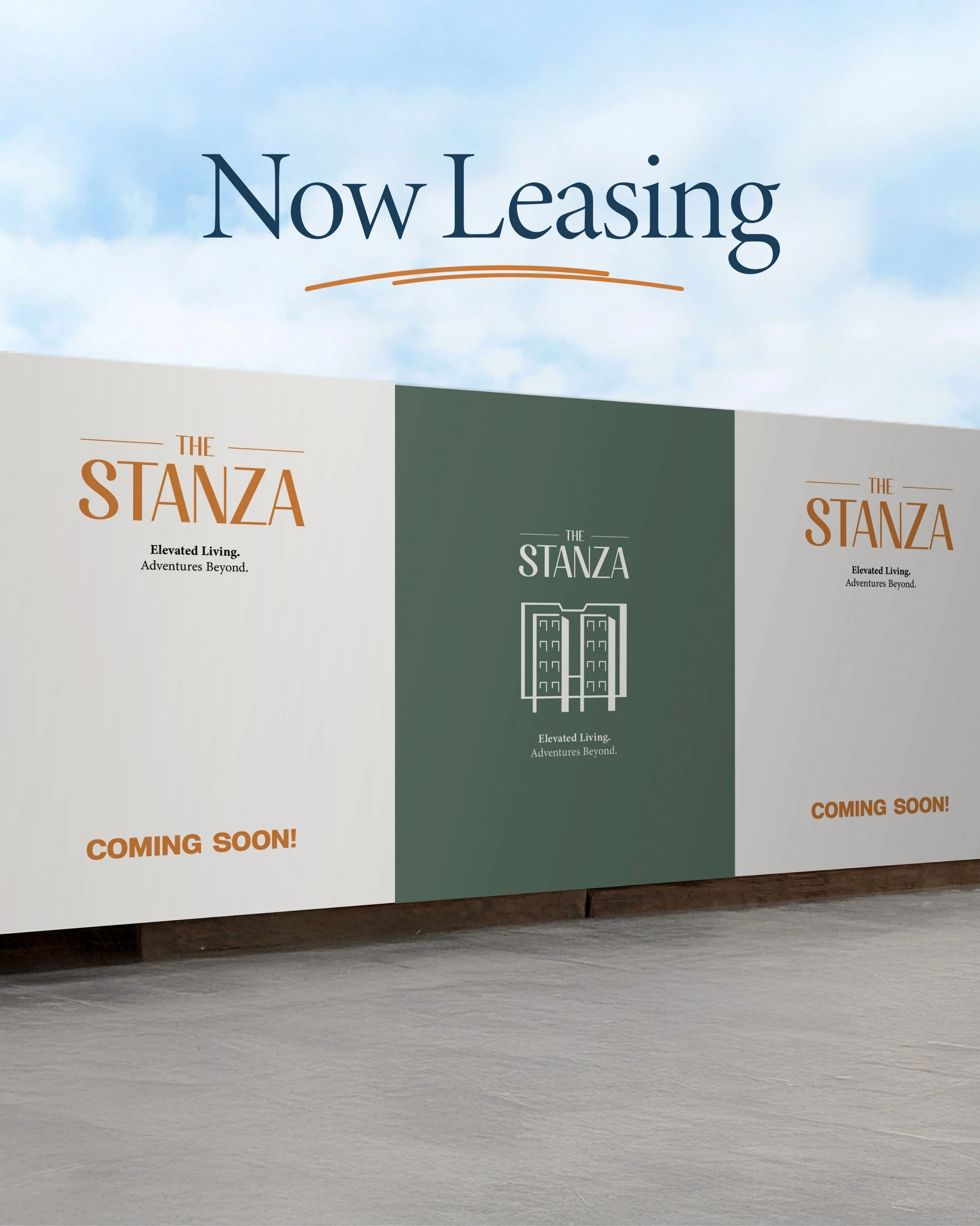
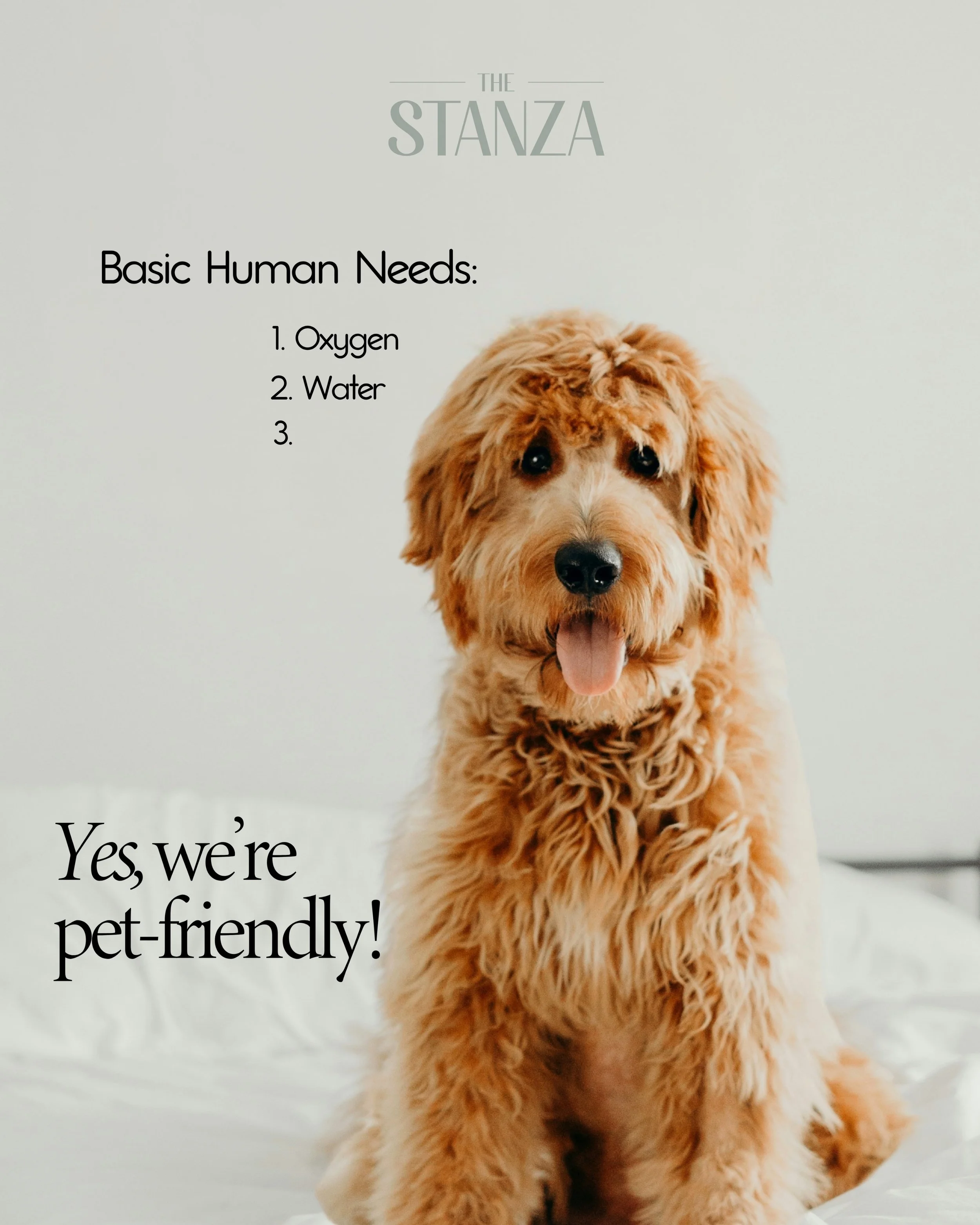
The Stanza
A brand identity designed to make apartment living feel a little more like home. The Stanza’s branding blends a refined, modern aesthetic with a sense of warmth and personality, creating a visual identity that feels elevated without feeling overly polished. From the logo, color palette, typography, and brand guidelines to campaign creative, every touchpoint was designed to bring the brand to life and connect with the people who would call The Stanza home.

Picklebalm
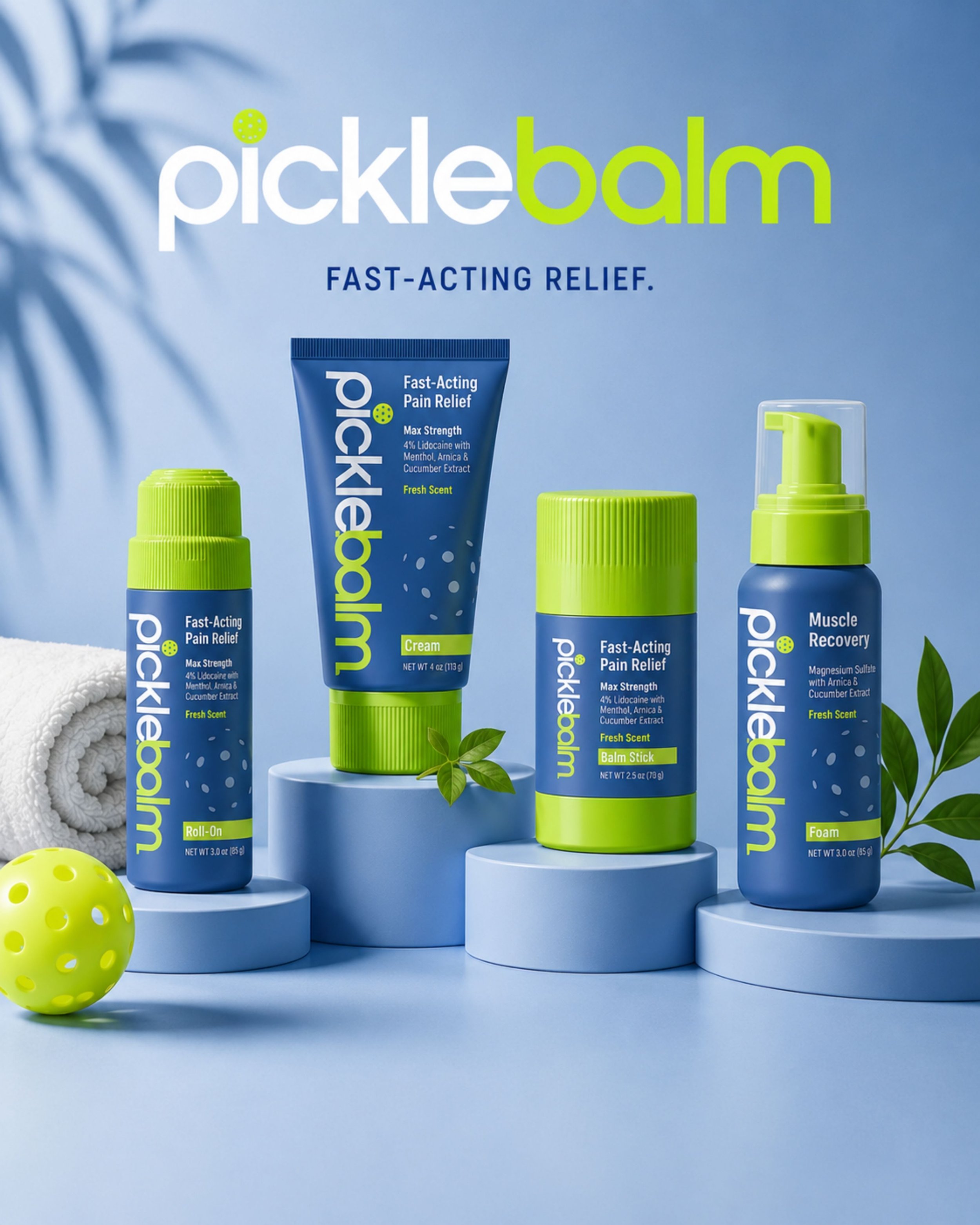
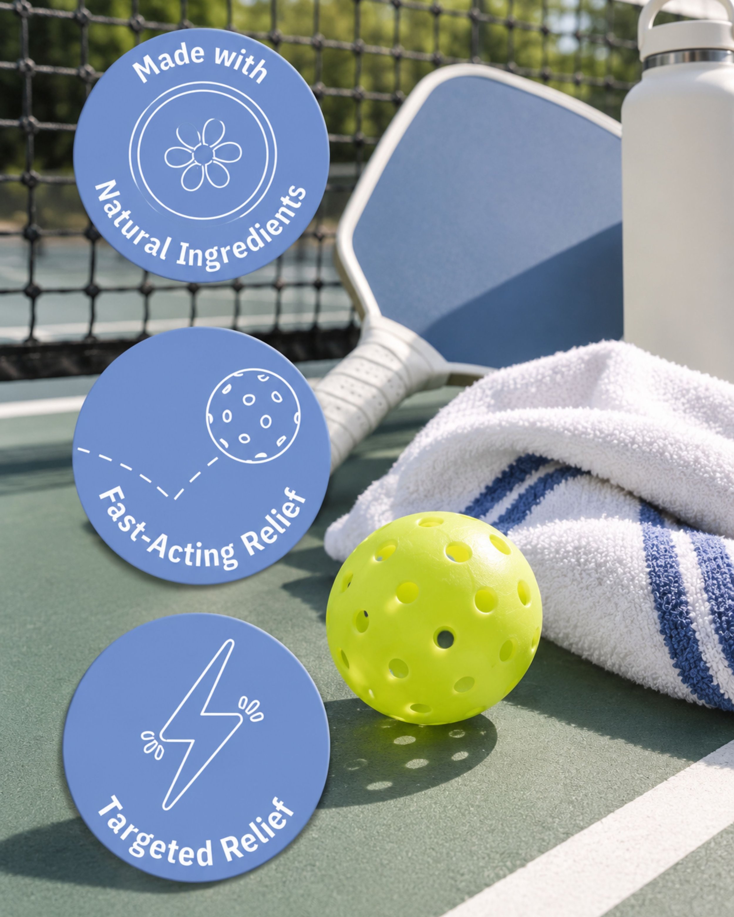
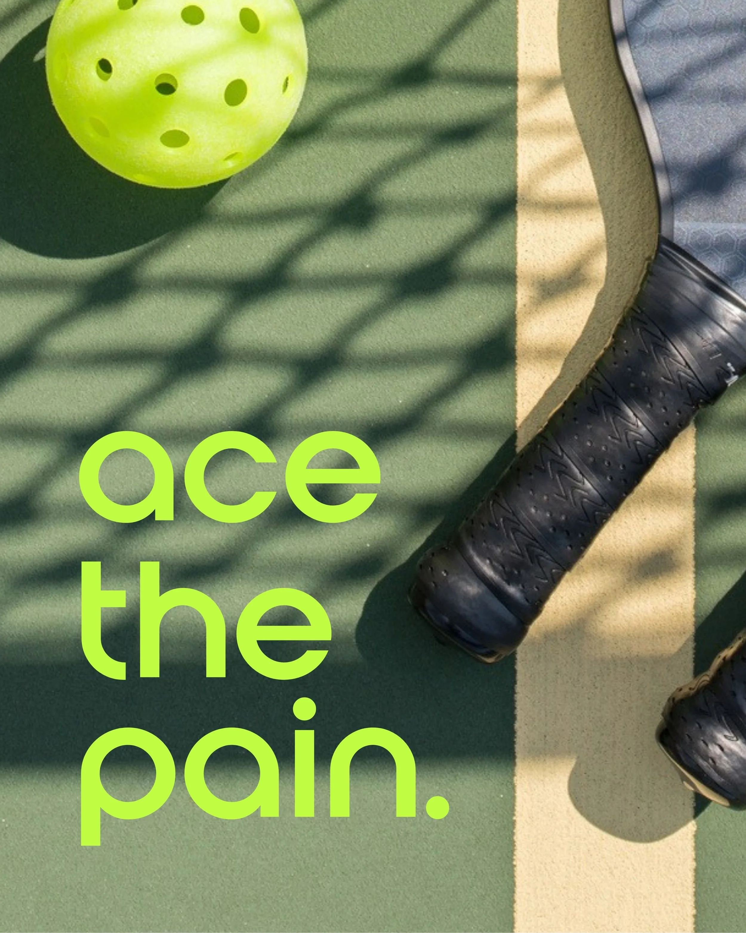
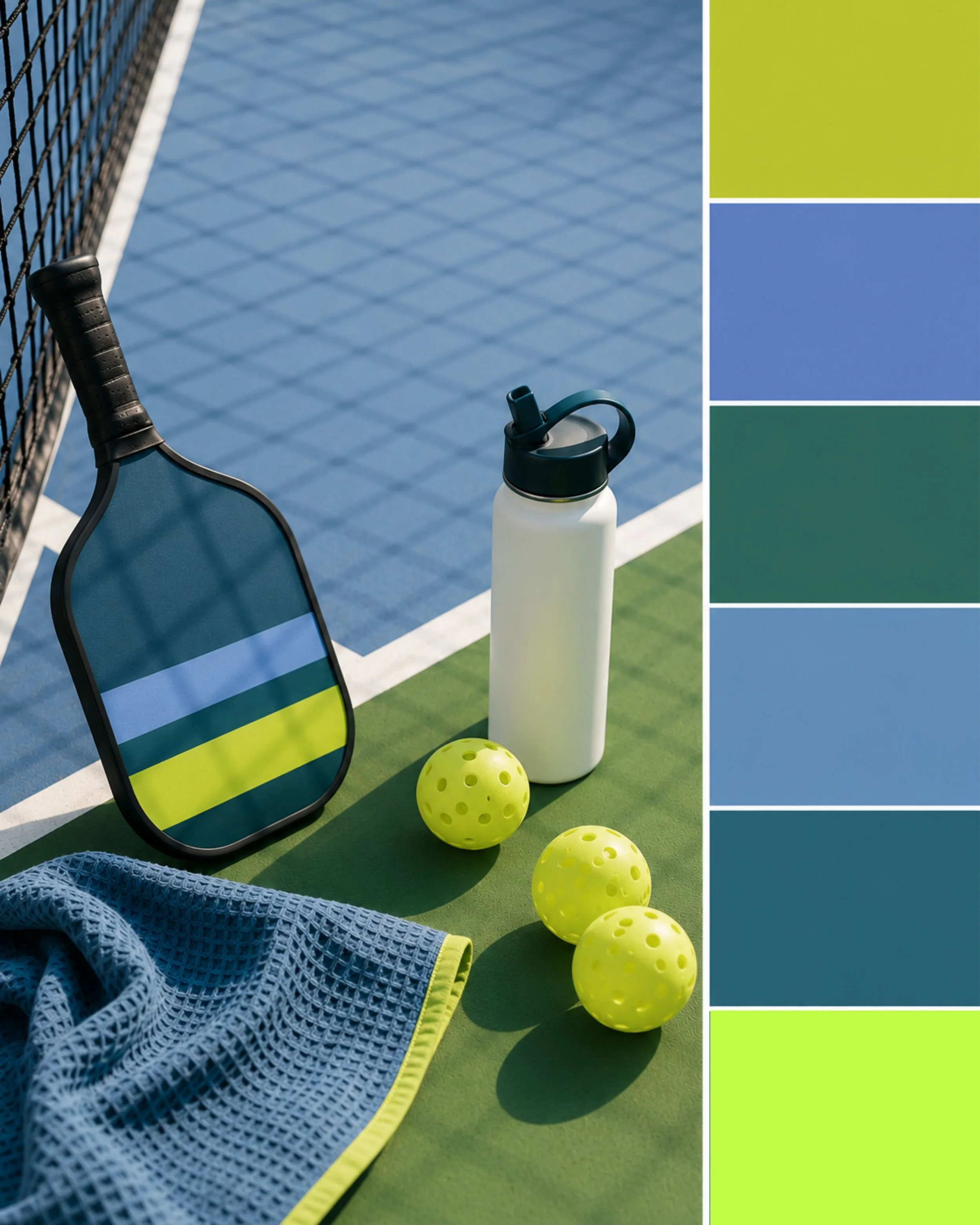
A bold, energetic brand identity created for Pickle Balm, bringing a fresh perspective to the world of sports recovery. Inspired by the movement, color, and personality of pickleball, the brand combines a vibrant palette, playful typography, and graphic elements that feel as active as the athletes it serves. From the logo and visual identity to product packaging, photography direction, and campaign creative, every touchpoint was designed to make recovery feel approachable, modern, and unmistakably fun.
tinyFaces
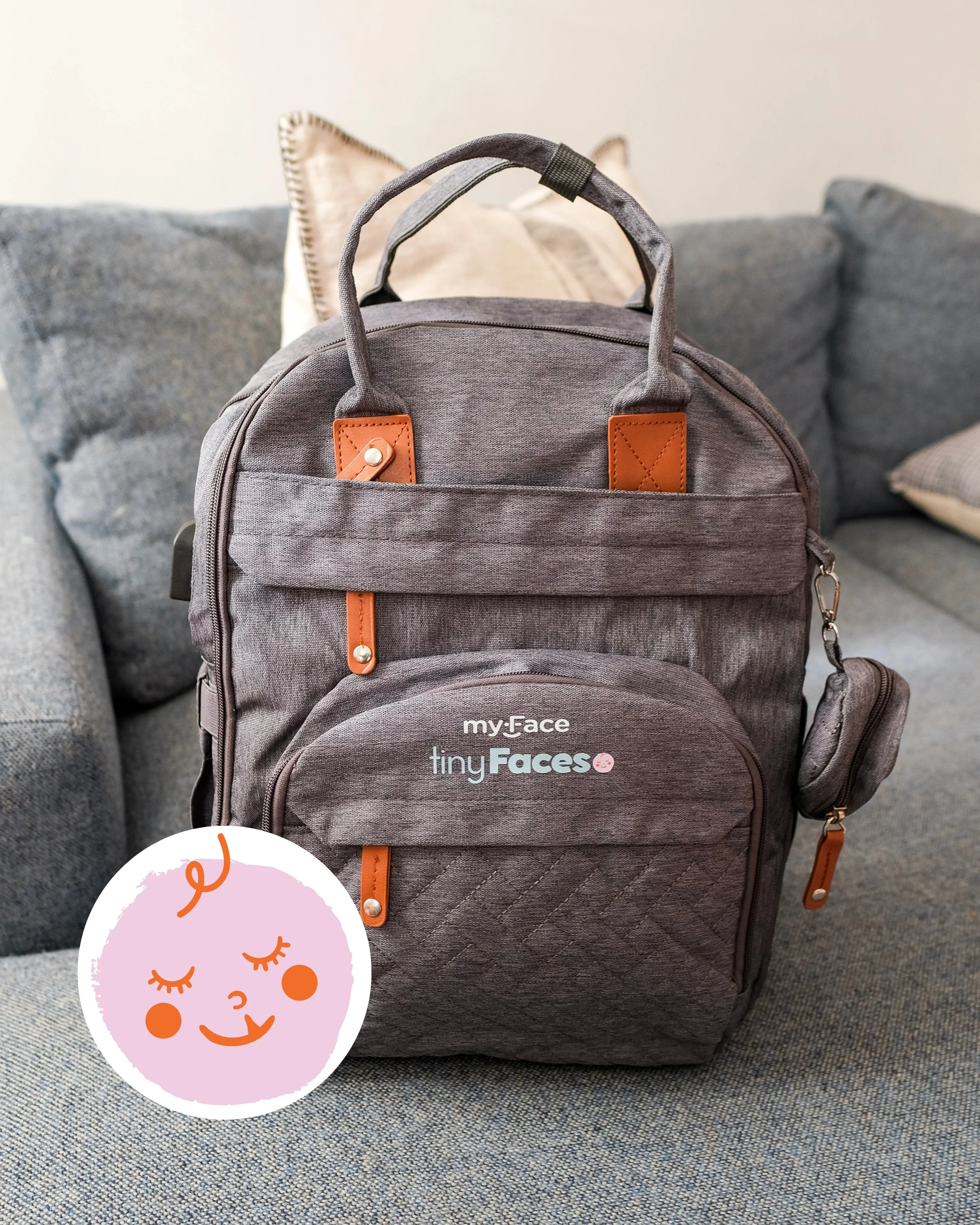
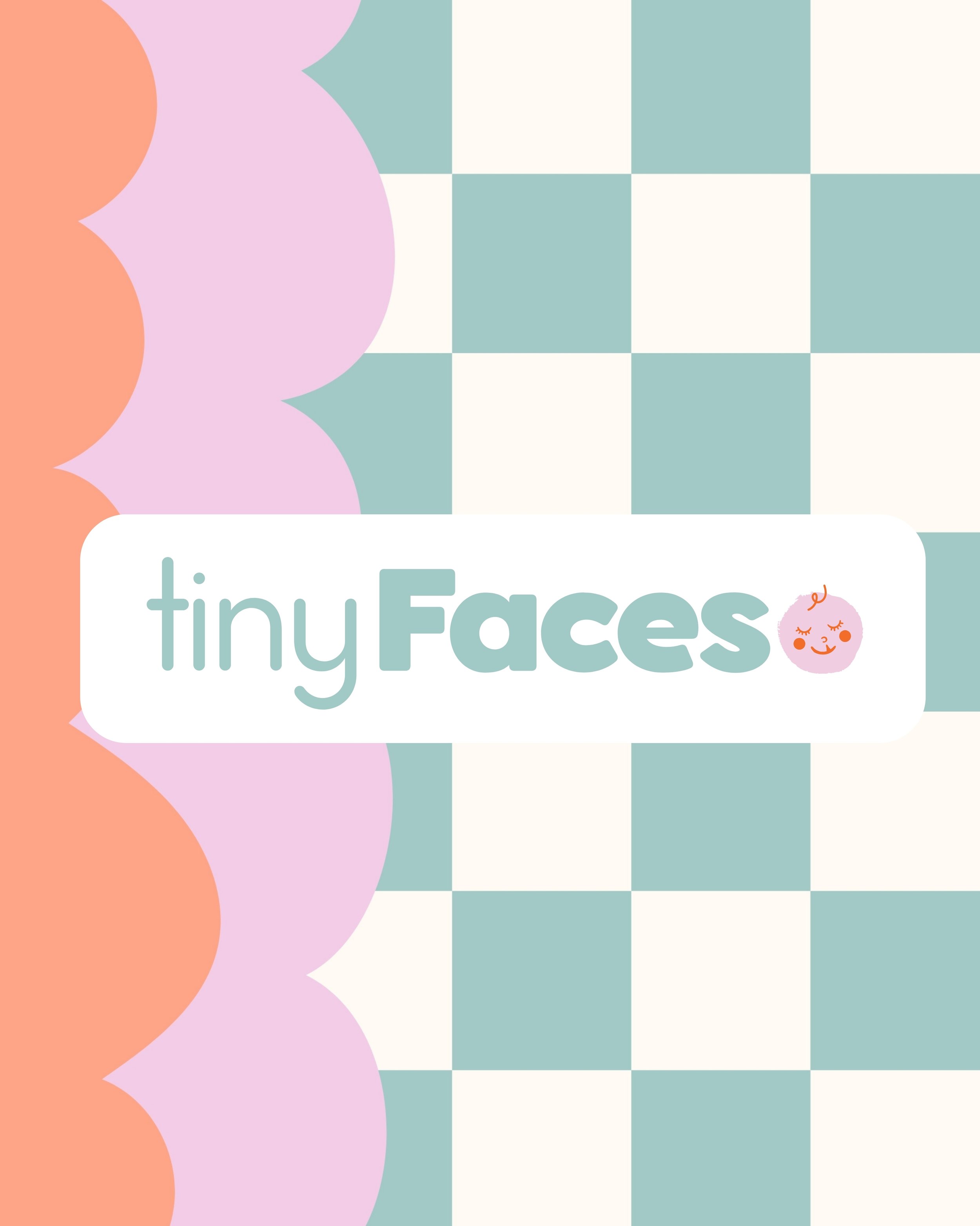
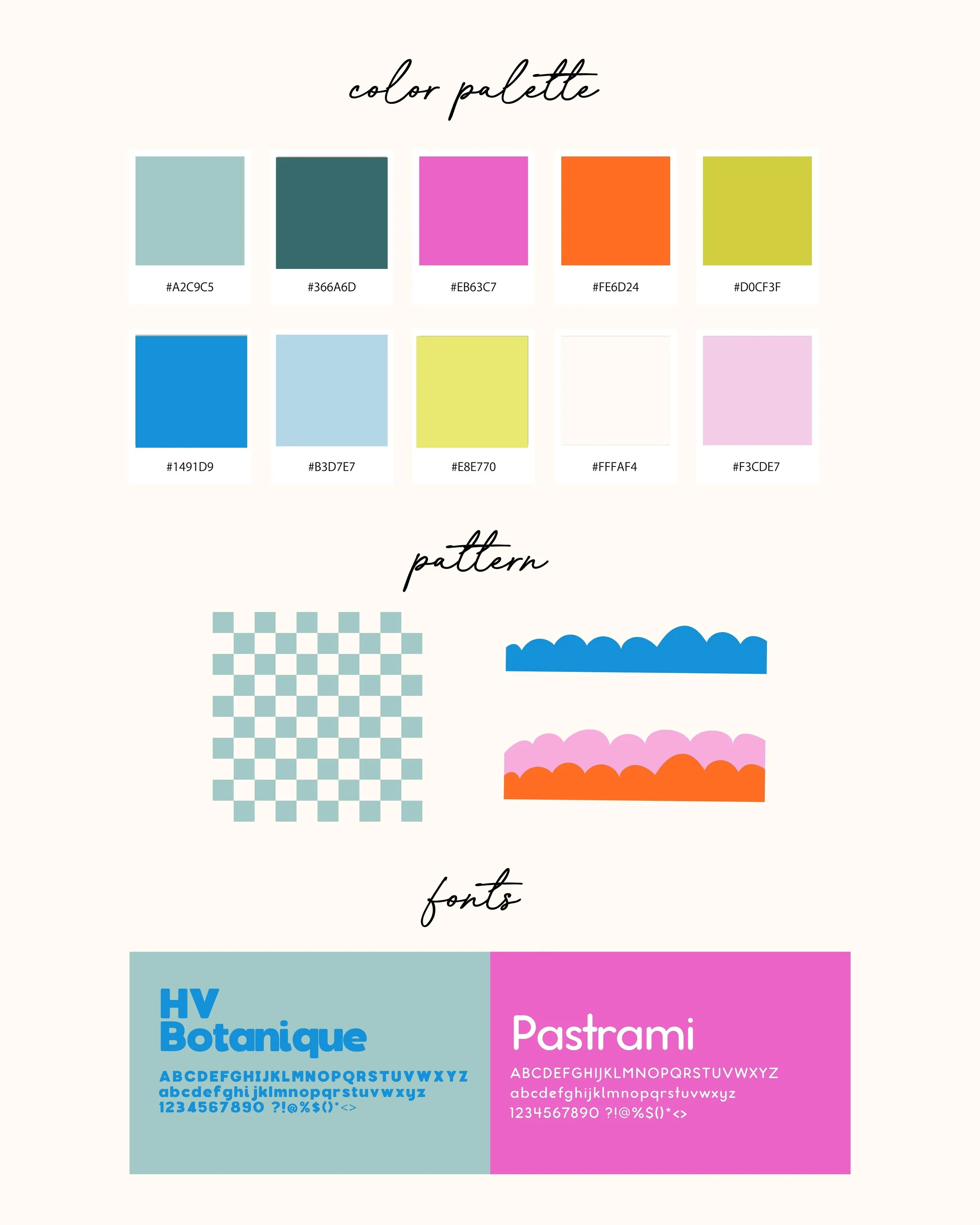
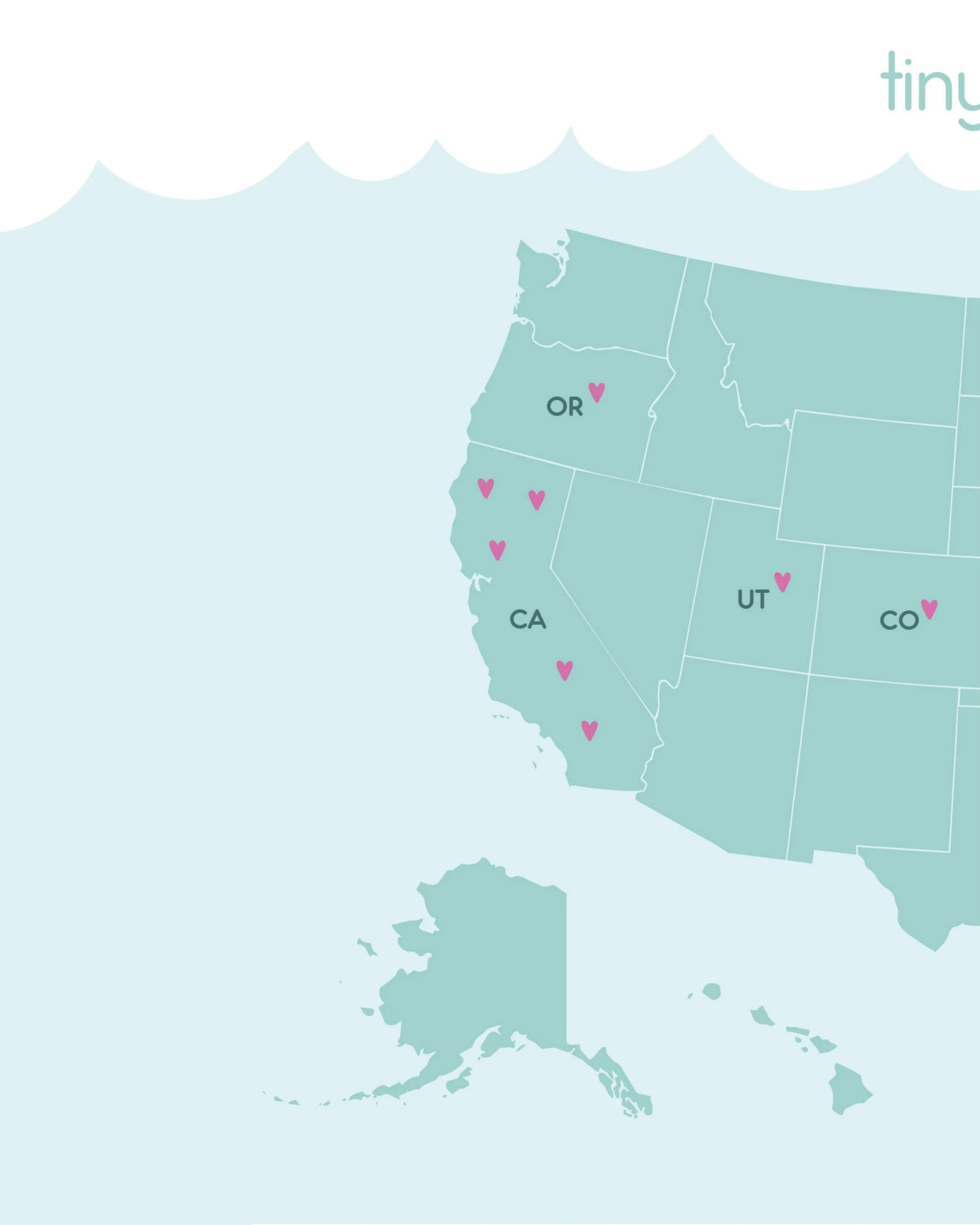
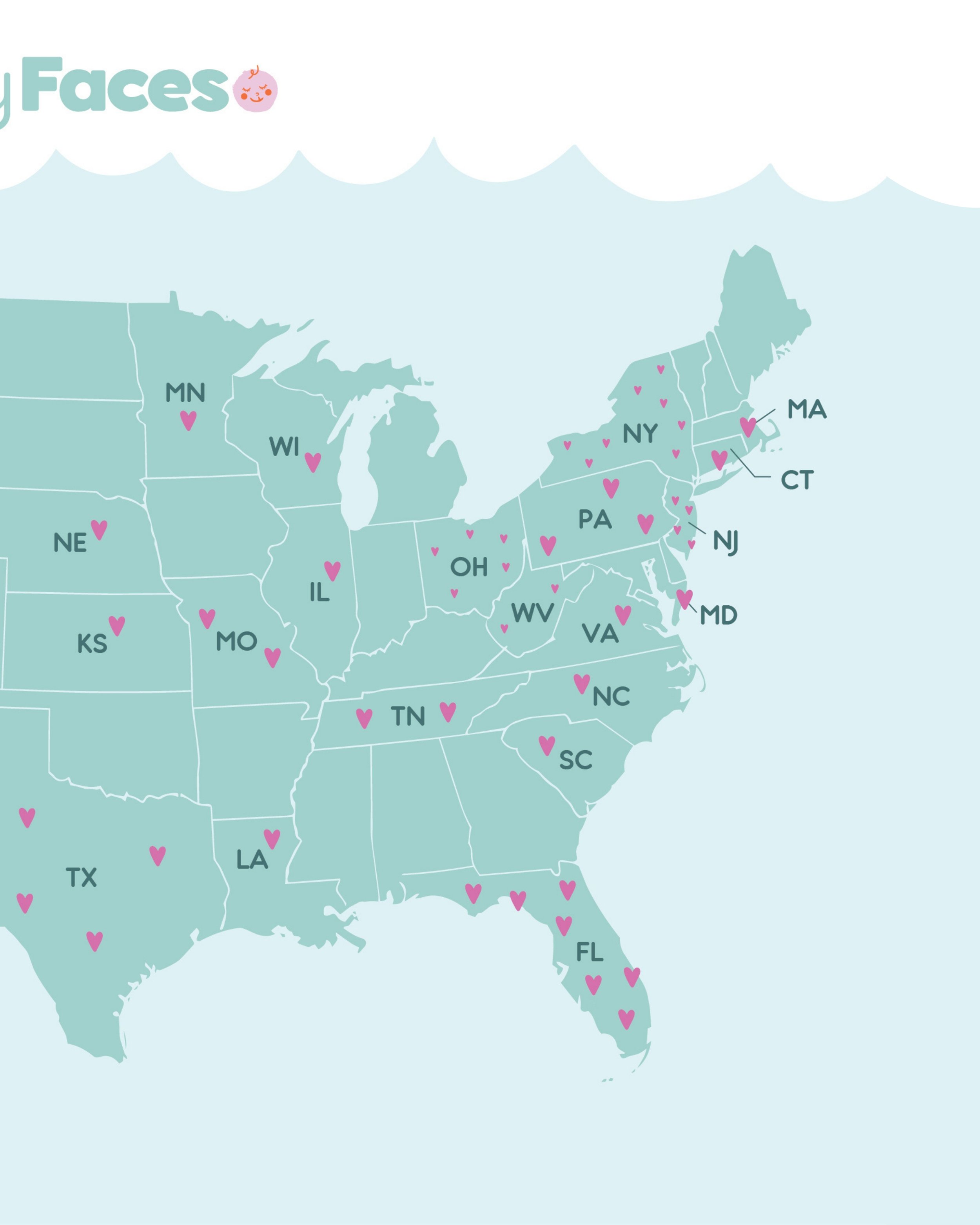
A brand identity created to bring warmth, comfort, and a sense of connection to families navigating a new and unexpected journey. tinyFaces pairs a playful, uplifting visual language with thoughtful storytelling, using bright colors, soft shapes, custom patterns, and approachable typography to create a brand that feels hopeful and reassuring. From the logo and visual identity to the tinyFaces backpack, maps, printed materials, and program touchpoints, every detail was designed to make families feel seen, supported, and a little less alone.
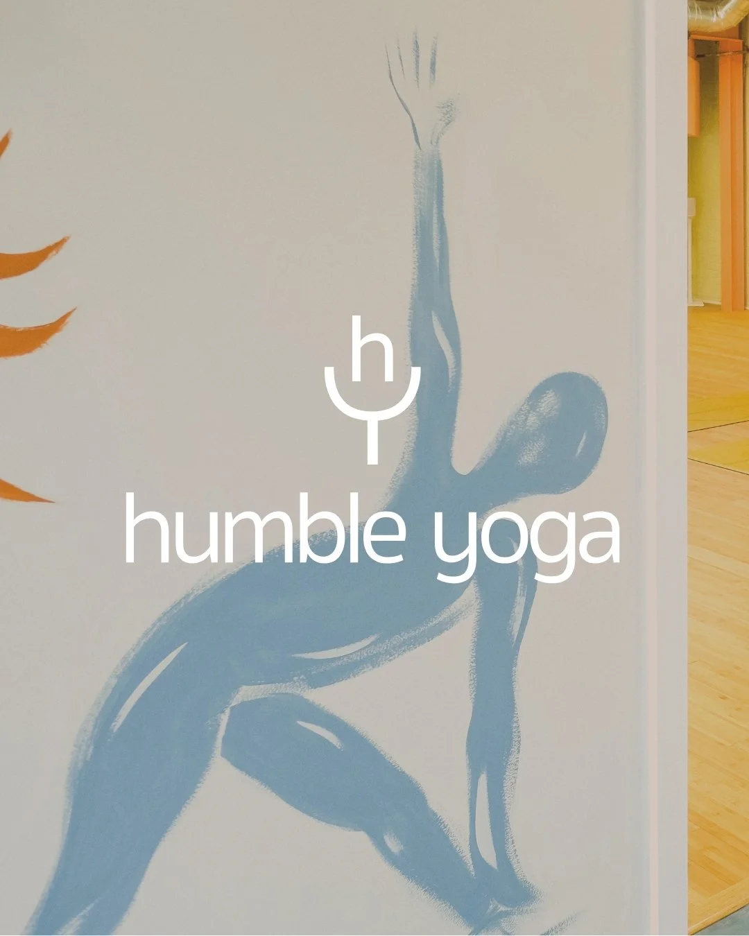
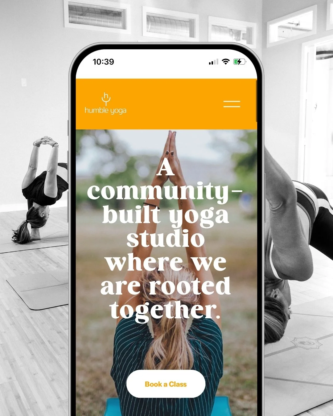
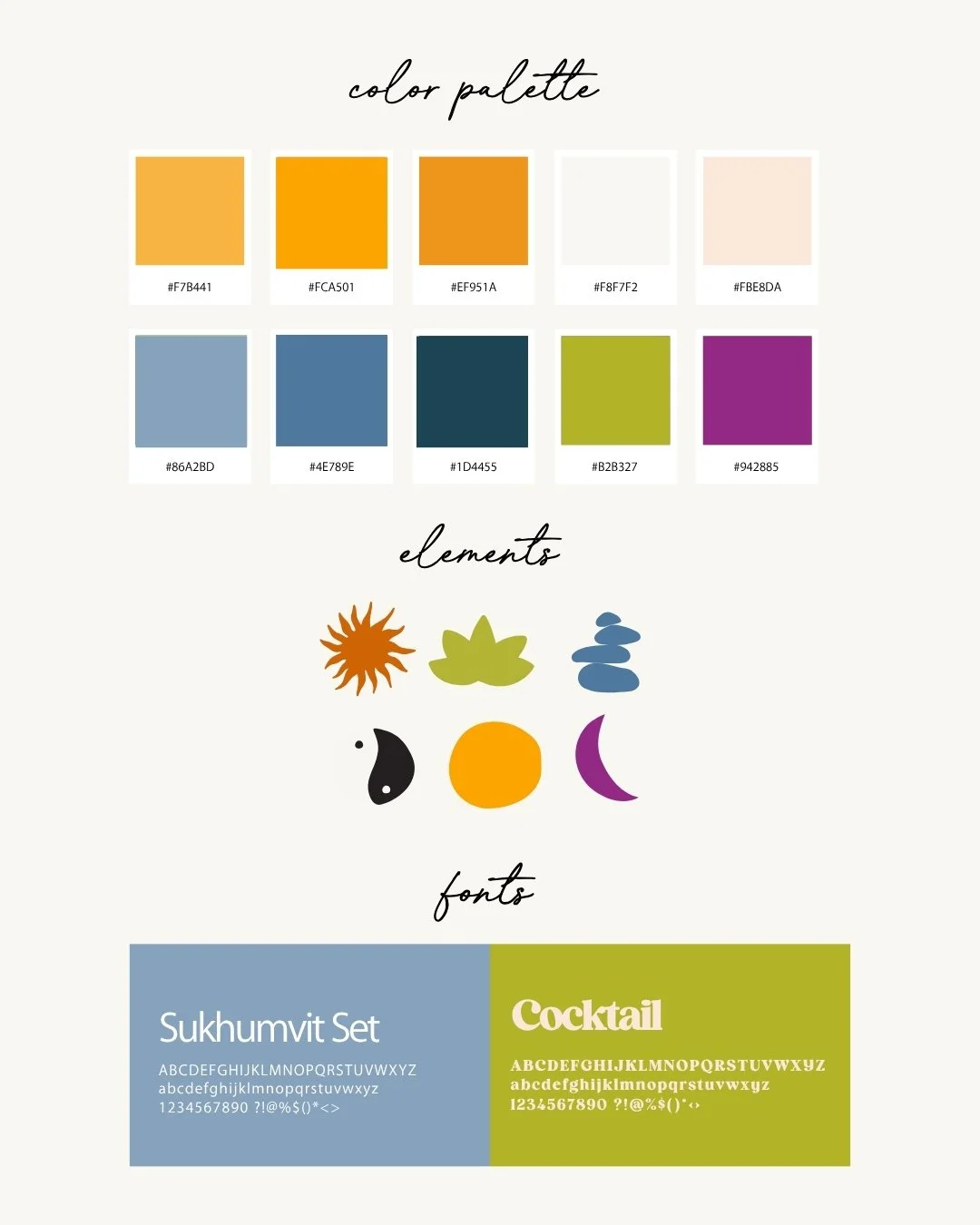
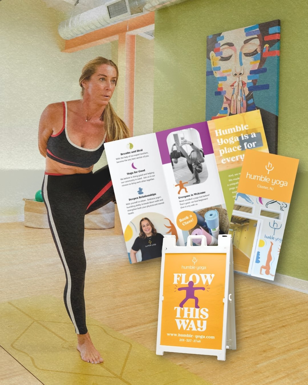
Humble Yoga
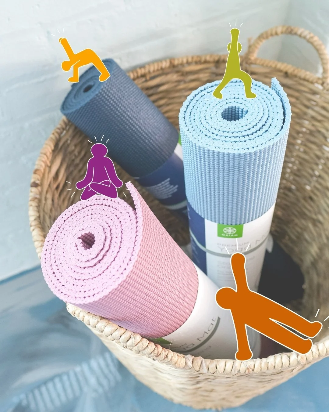
A brand identity rooted in movement, community, and finding a little more balance in everyday life. Humble Yoga’s visual identity combines playful colors, organic shapes, and expressive illustrations to create a brand that feels energetic, welcoming, and inclusive. From the logo, color palette, and custom graphic elements to print materials, studio collateral, photography direction, and website design, every touchpoint was created to bring the spirit of the studio to life—warm, joyful, and rooted in community.
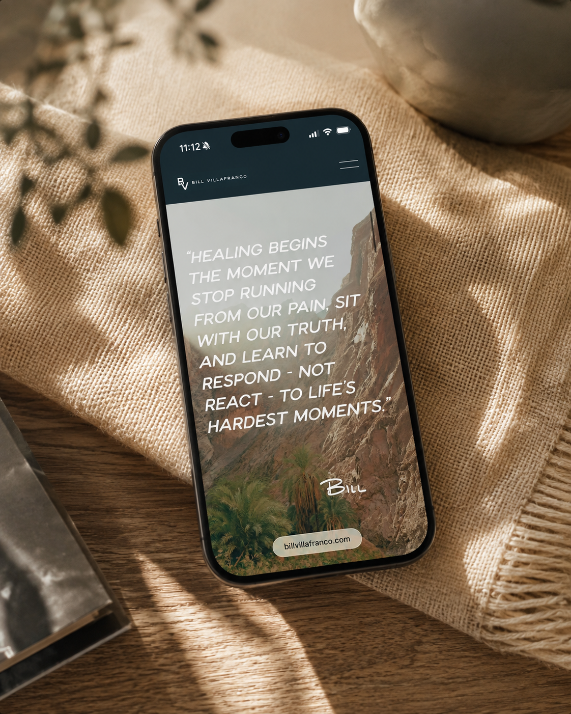
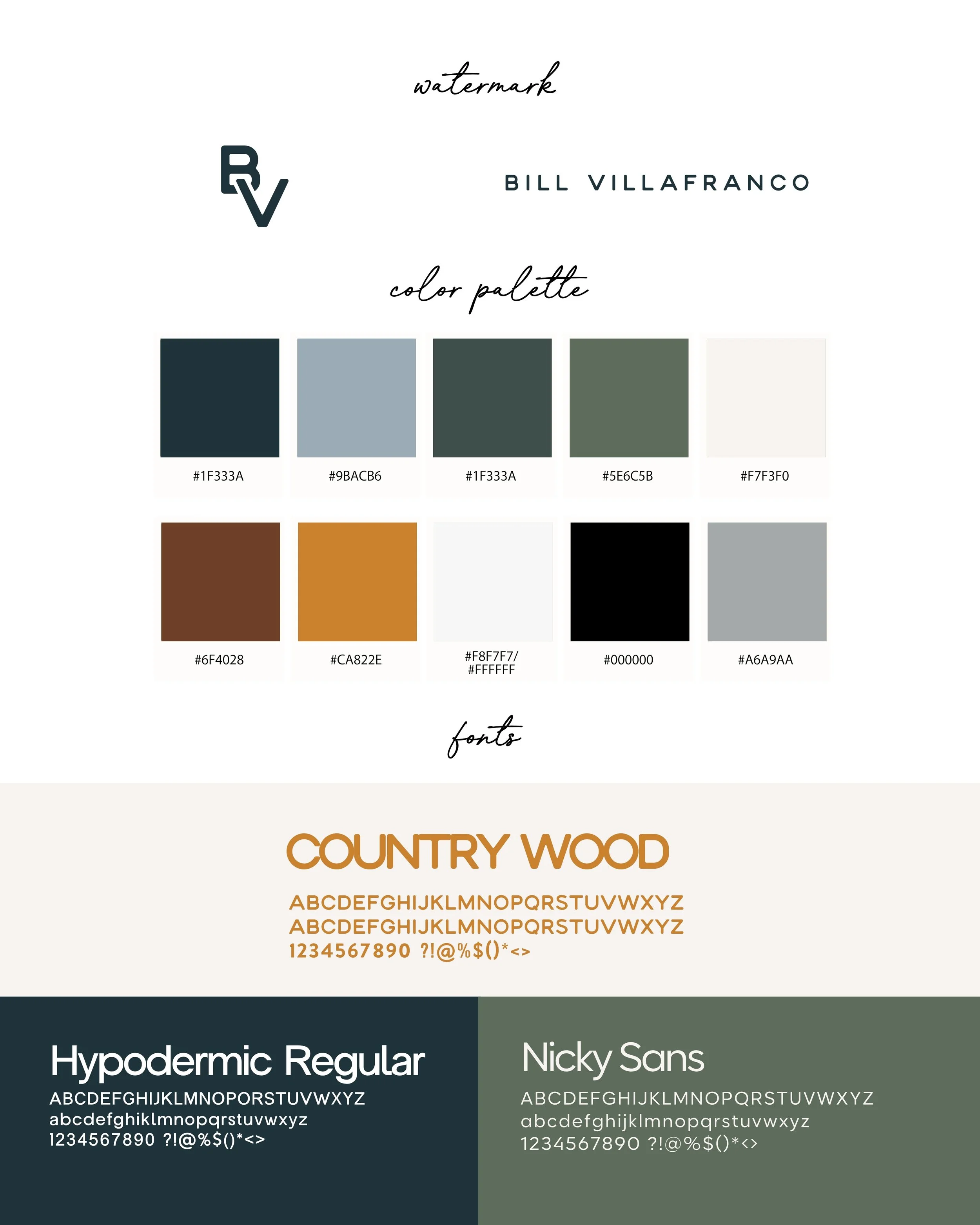
Bill Villafranco
A personal brand designed to capture Bill Villafranco’s warmth, wisdom, and belief in the power of possibility. The identity balances a refined, confident aesthetic with earthy tones and human storytelling, creating a brand that feels both credible and deeply personal. From the logo and visual identity to the website, social content, photography direction, and speaking materials, every touchpoint was designed to position Bill as a thoughtful, inspiring voice while letting his story and message take center stage.


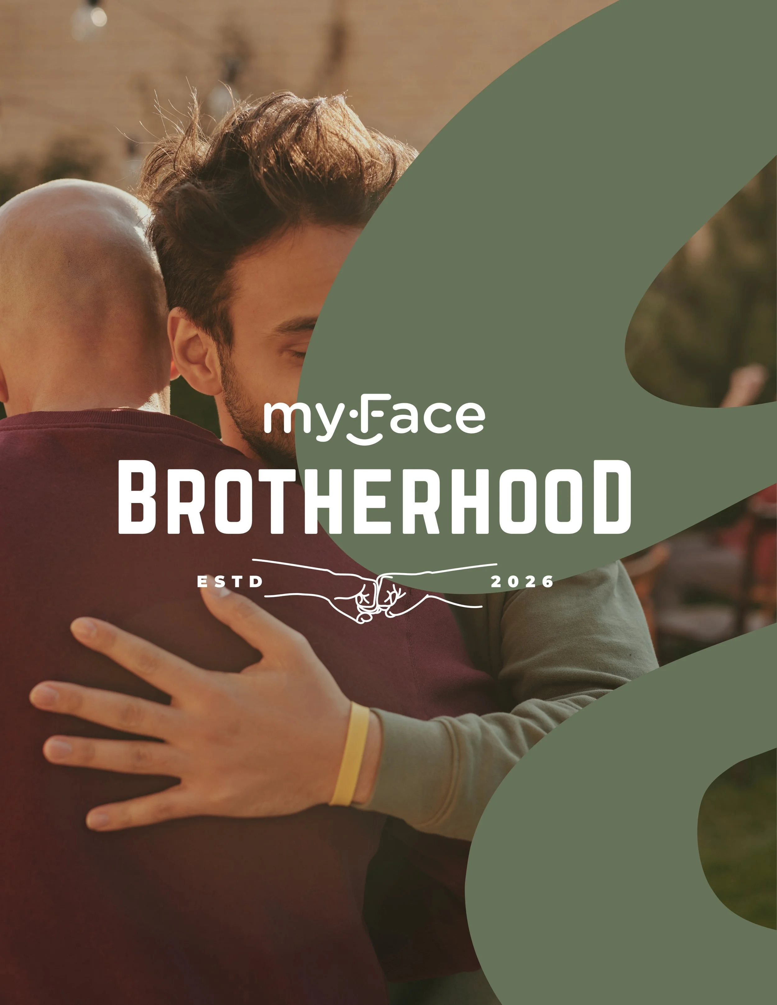
myFace
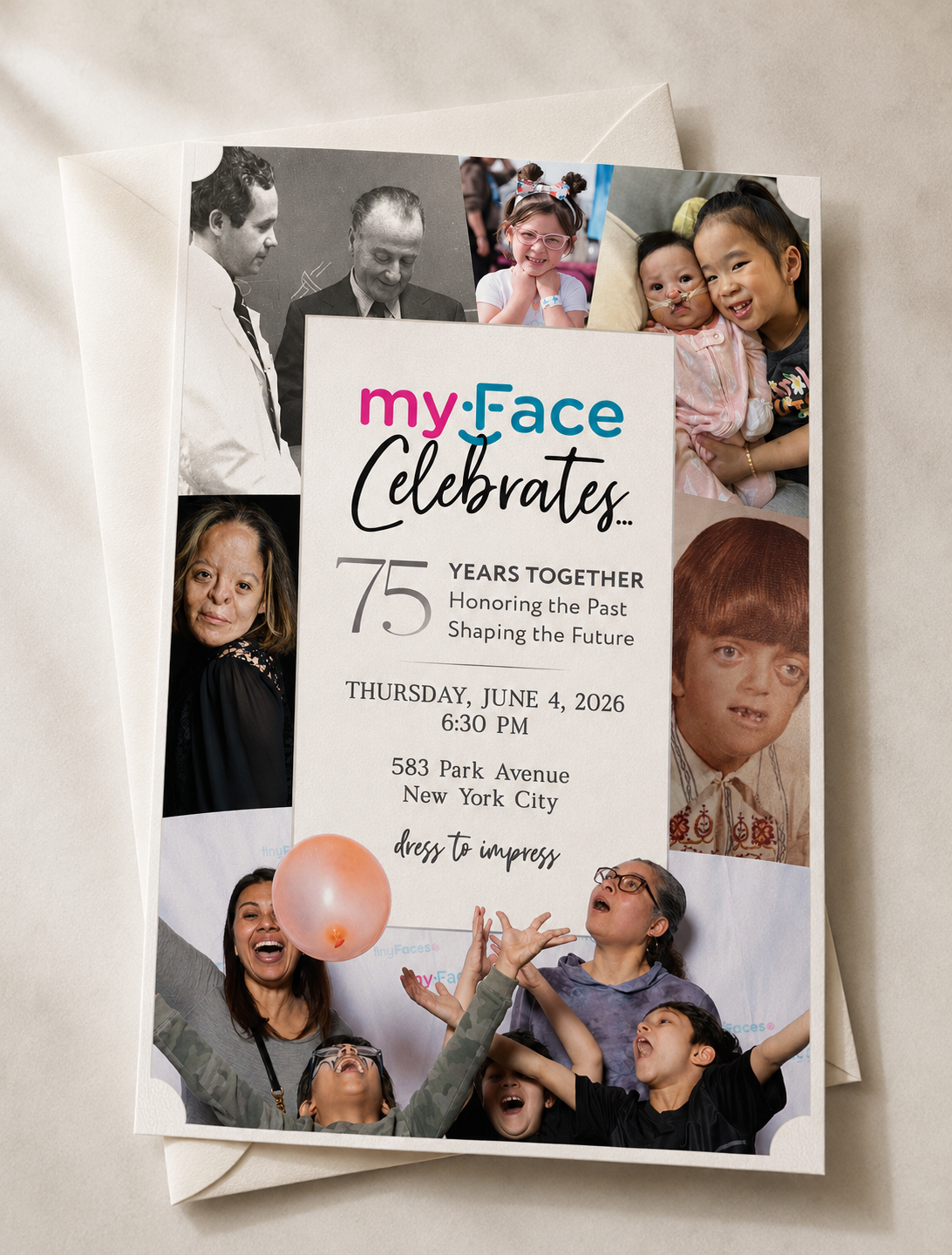
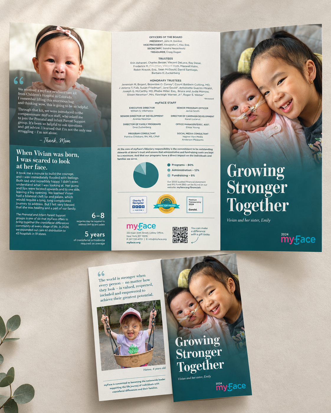
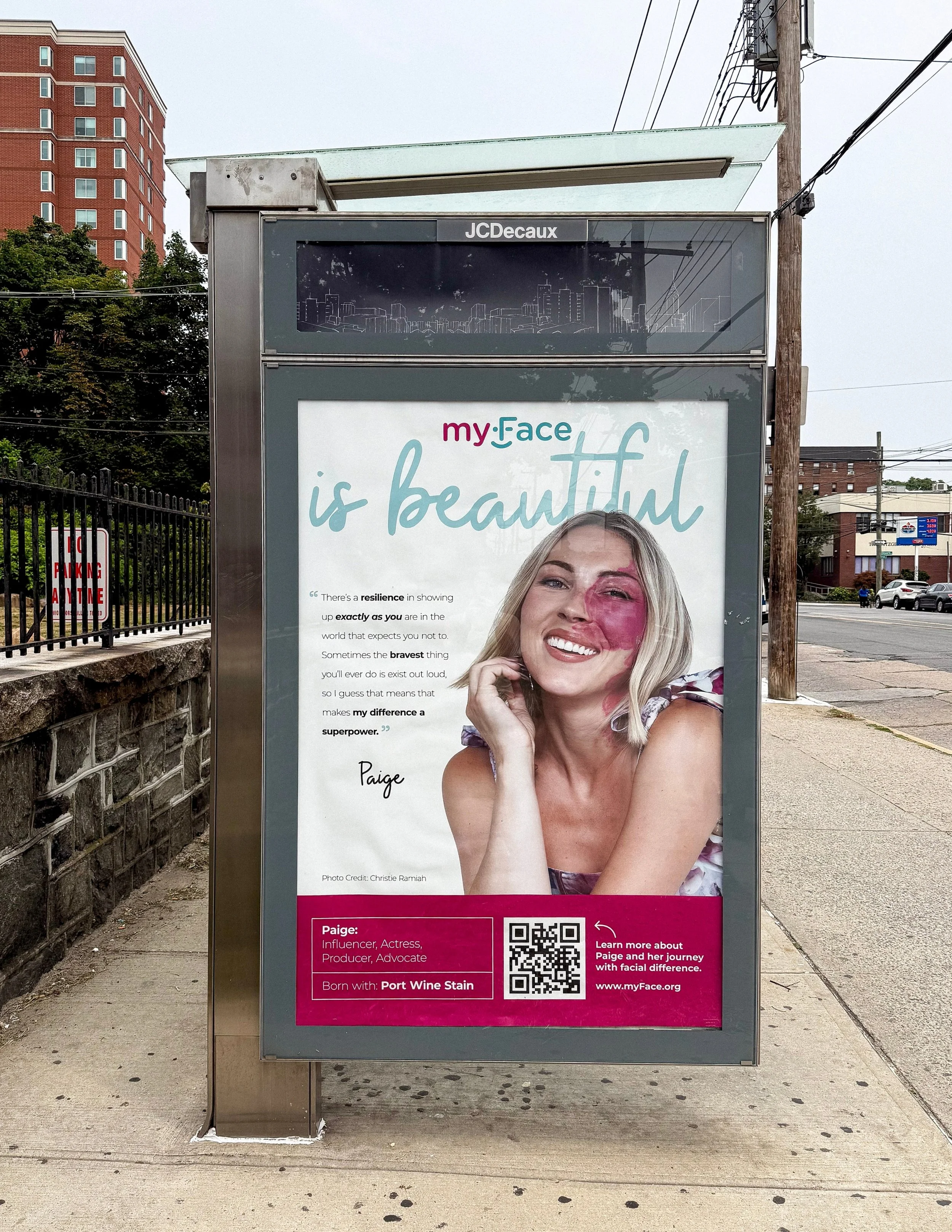
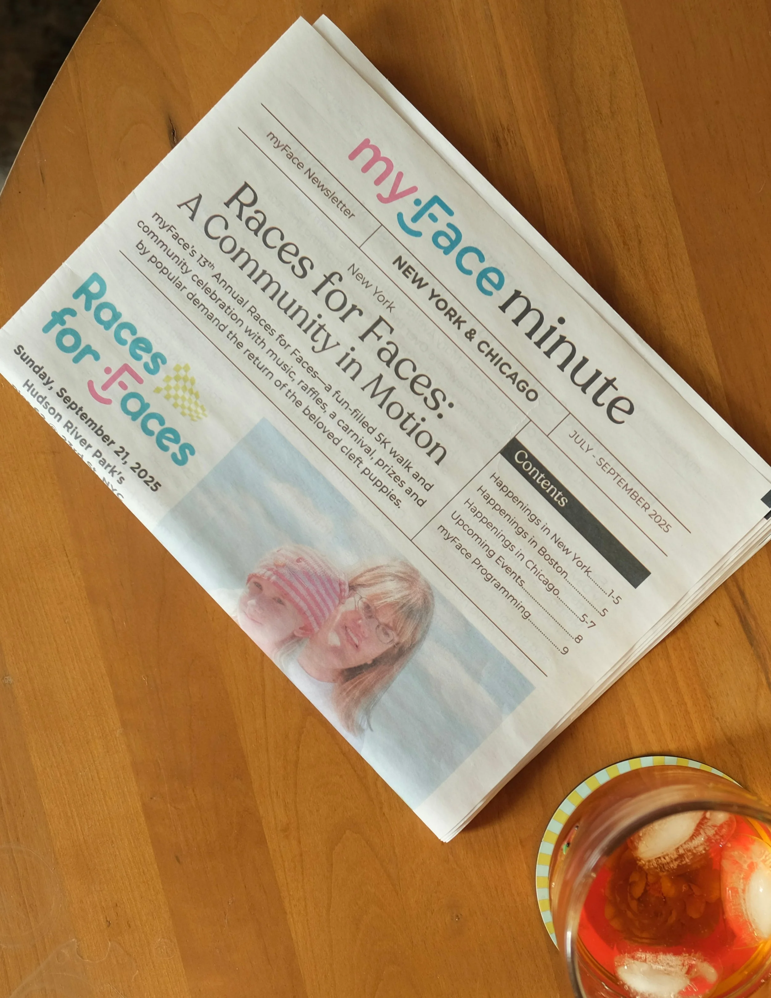
A creative partnership focused on bringing the myFace mission to life through thoughtful, human-centered storytelling. Across campaigns, events, advocacy, publications, digital experiences, and community initiatives, the work blends bold design with deeply personal stories to celebrate individuality, build connection, and create visibility for the craniofacial community. From myFace Celebrates and Brotherhood to print publications, outdoor campaigns, and program materials, each piece is designed to feel hopeful, inclusive, and unmistakably myFace.
Virginia B. Toulmin Foundation
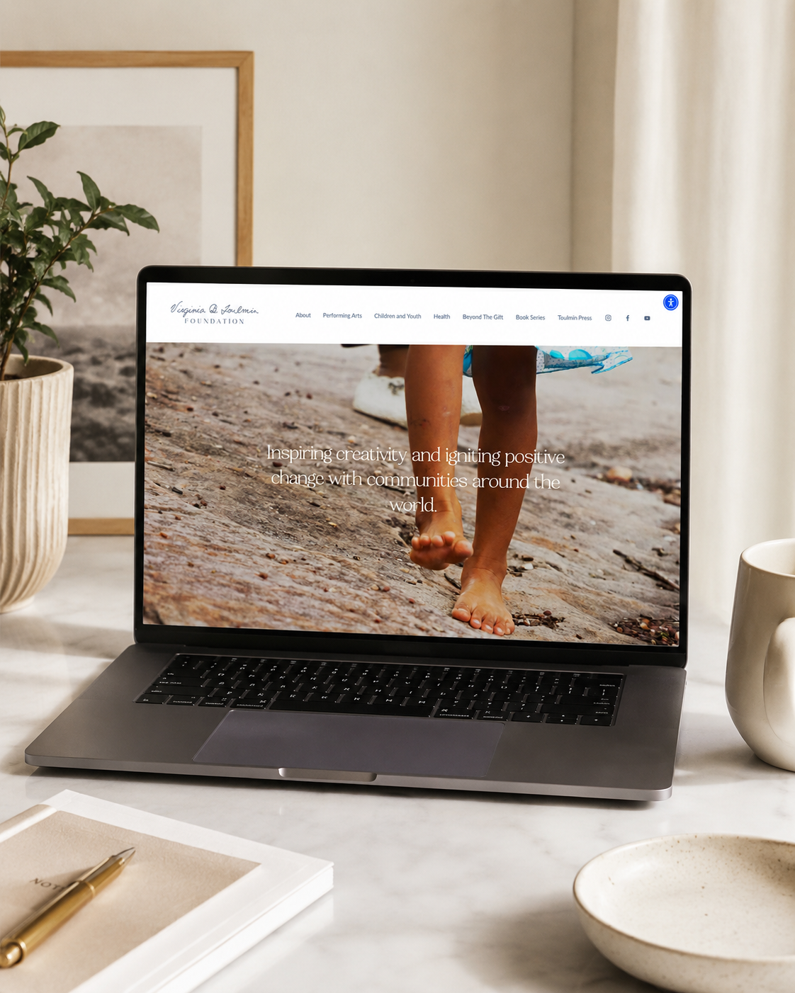
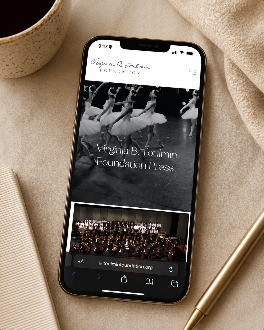
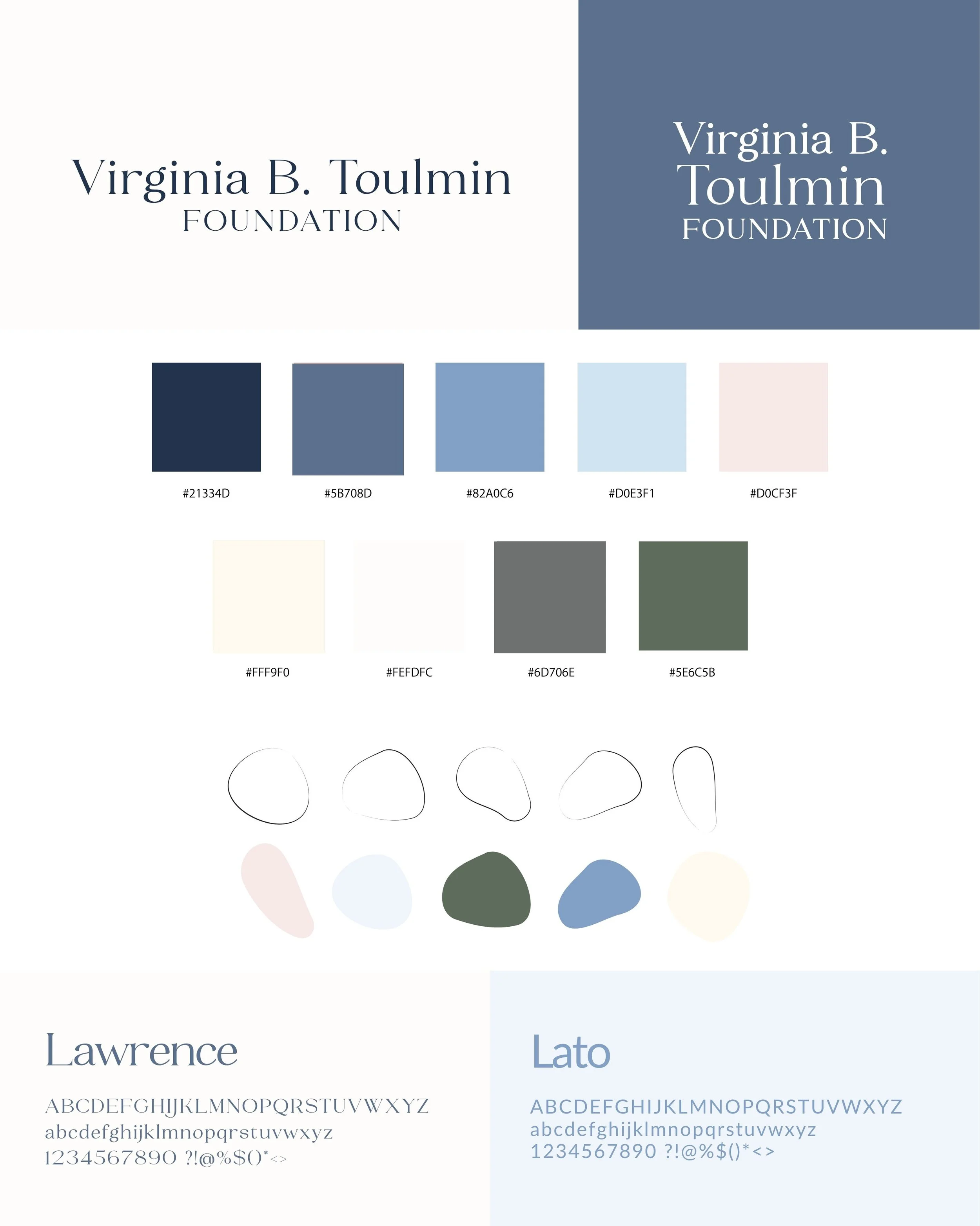
A thoughtful brand identity created to honor the legacy of Virginia B. Toulmin while bringing the foundation’s mission into a contemporary visual world. The identity balances timeless typography with a soft, refined palette, handwritten details, and archival-inspired imagery—with a subtle nod to Virginia’s personality woven throughout. From the logo and visual identity to the website, digital presence, and storytelling materials, every touchpoint was designed to feel personal, purposeful, and reflective of the woman behind the legacy.

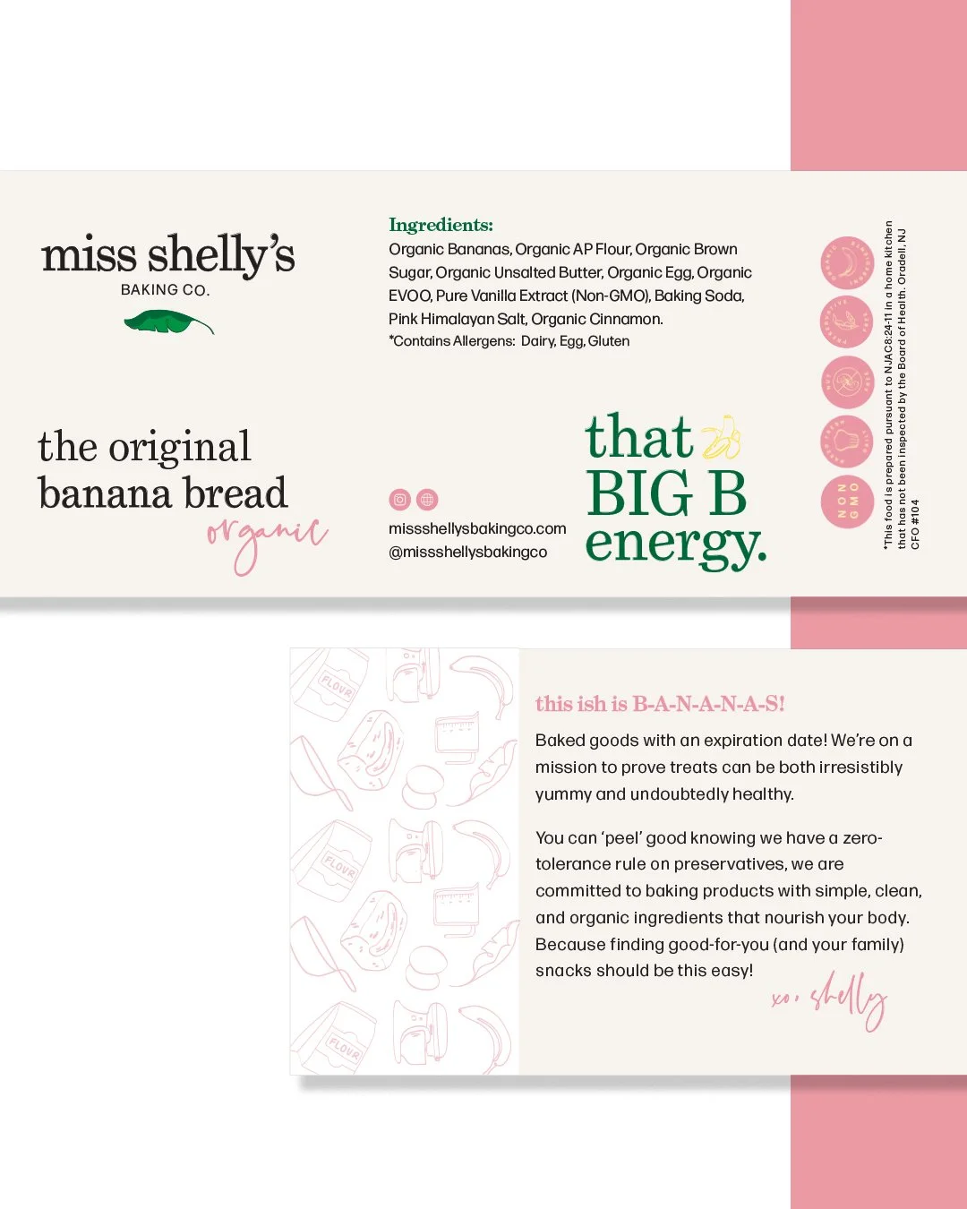
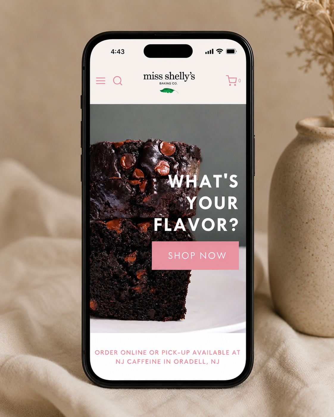
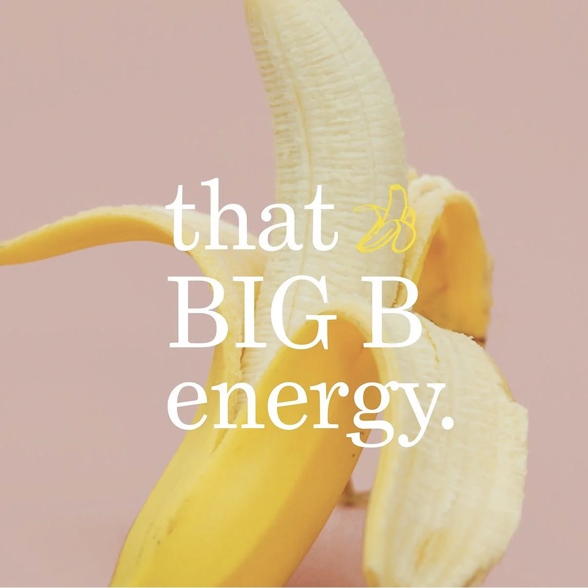
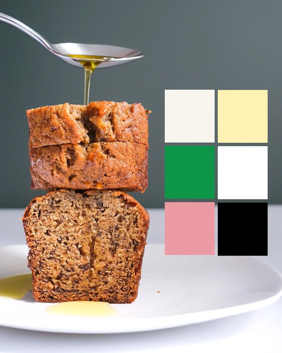
A playful, personality-driven brand created for Miss Shelly’s Baking Co., bringing a fresh point of view to better-for-you baked goods. The identity balances sophisticated typography with bright pops of color, unexpected details, and a healthy dose of personality—creating a brand that feels as good as the products taste. From the logo and packaging to messaging, photography direction, digital design, and e-commerce experience, every touchpoint was designed to make Miss Shelly’s feel approachable, energetic, and unmistakably its own.
Miss Shelly’s
Here, creativity meets opportunity. Whatever you're building, we're here to help you take the first step with confidence. Driven by curiosity and built on purpose, this is where bold thinking meets thoughtful execution. Let’s create something meaningful together.
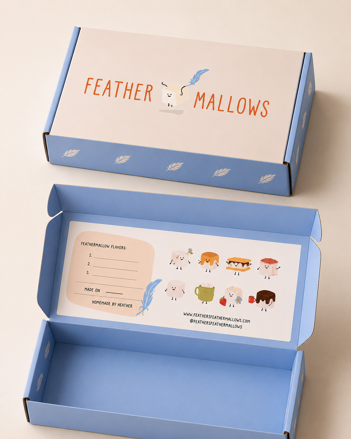
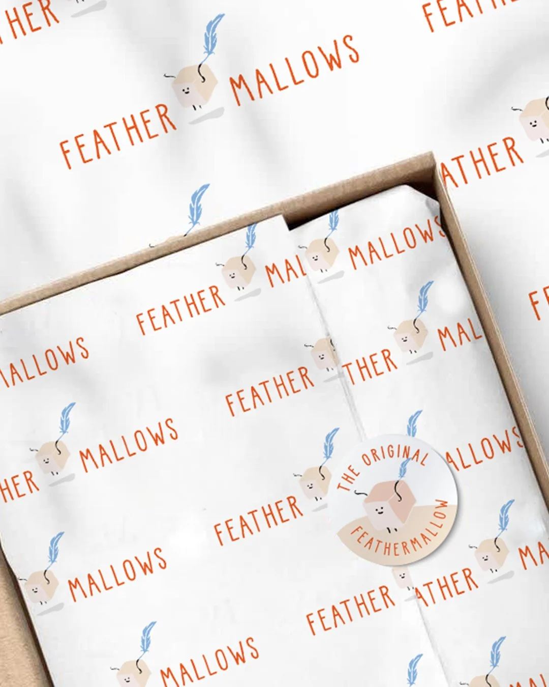
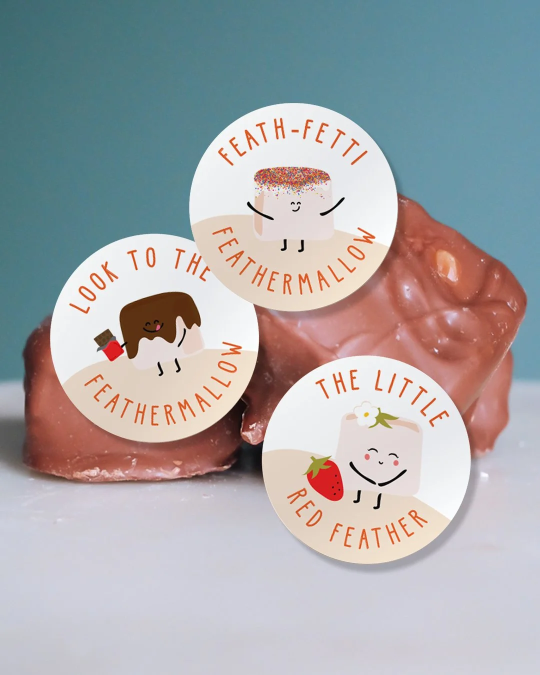
Feathermallows